Page 1 of 3
Behind the Scenes of the Earth Observatory
Using Science to Communicate Science
Since 1999 NASA’s Earth Observatory has produced more than 12,000 data visualizations, images, and maps. To do so, we have adopted an approach that enables us to be both consumers and producers of science. In other words: we use science to inform how we communicate science.
Mapping Ukraine's Refugees
A Defense of Proportional Arrows from Geography's Radical Past

Disasters are the great catalysts of cartography. There is no stronger impetus for new maps than earthquakes, landslides, floods… and wars.
With new maps come new desires. The field of cartography has come a long way, and both its practitioners and students have learned a great deal. Myriad data sources are within an ever-closer grasp, and we’ve learned to approach each with more care, more diligence, and more responsibility.
2020 Top 10
The Earth Observatory's best of 2020
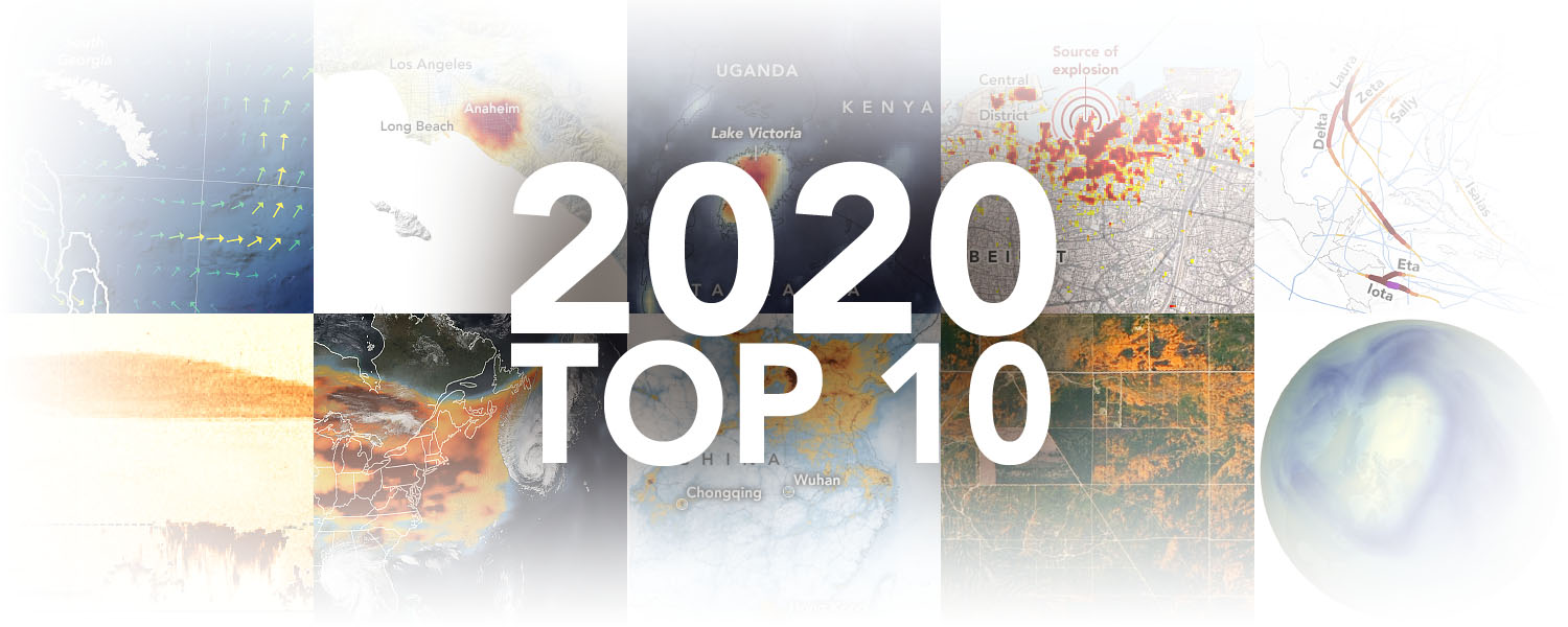
The NASA Earth Observatory publishes a new image-driven article every day. This torrent of graphics is enhanced by coverage of breaking news, natural hazards, and periodic, deep-diving features. As a result, our team easily publishes more than 500 visuals each year. Choosing the ten best from such list is no small task. And it inevitably leaves out numerous pieces that, to be honest, pains me to exclude. Nonetheless, ten it shall be.
The Red Planet
New Map Poster of the Topographic Relief of Mars
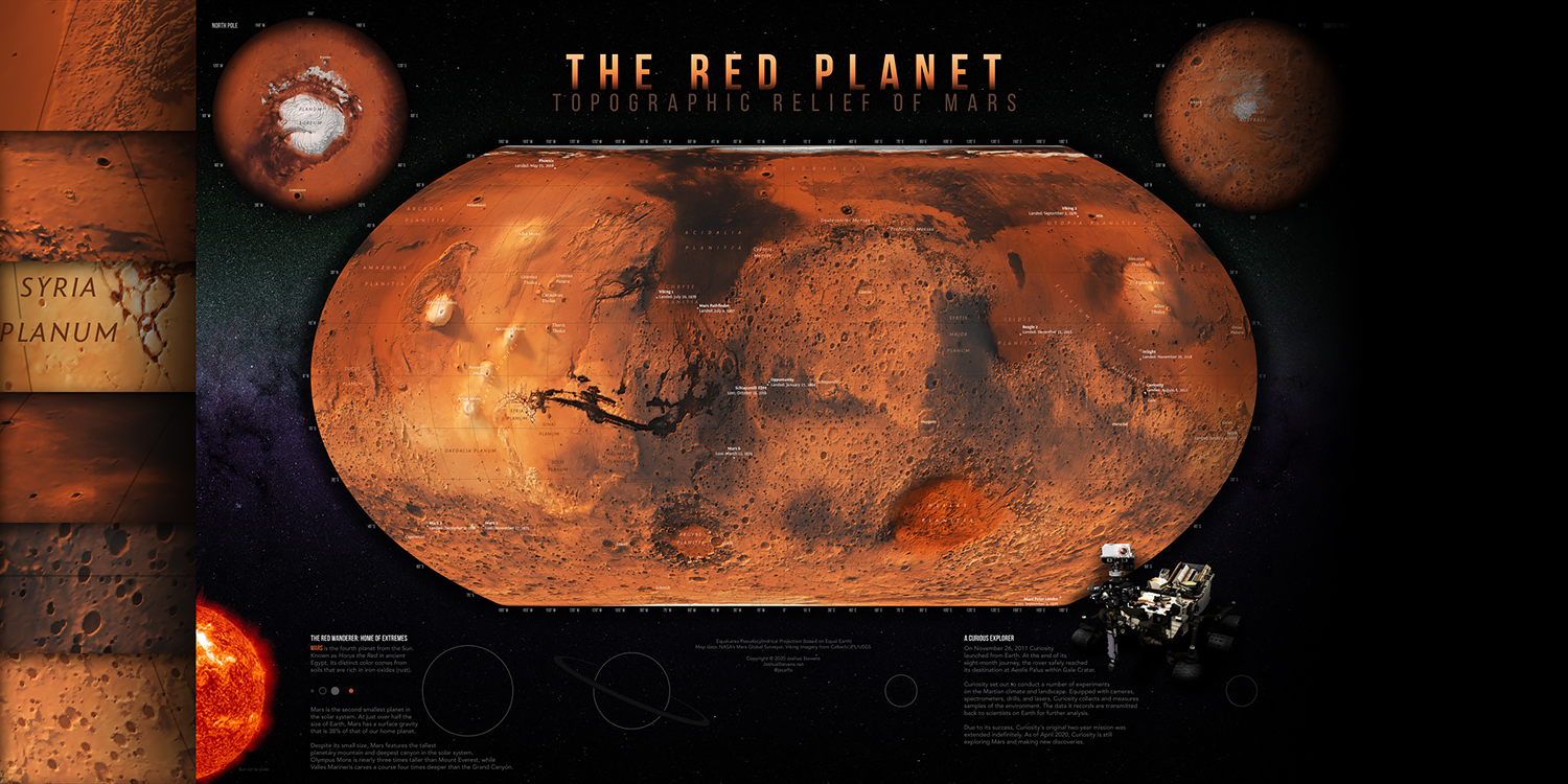
I am extremely pleased to release a new poster showcasing the topographic relief of Mars.
My days are usually filled with Earth. Satellite images, maps, data analysis… all originating from, or looking at, our blue planet. The third rock from the Sun.
Sometime last year I decided to figuratively leave Earth and see what’s going on with our skyward neighbor.
Pinewood Nerdy
Wood cars. An aluminum track. And lots of data.
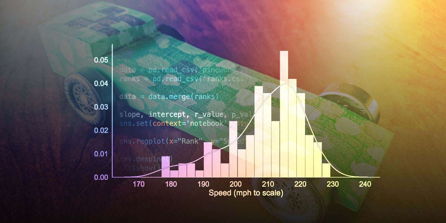
I was not sure what to expect when my son wanted to sign up for cub scouts. But I knew, at some point, Pinewood Derby would come into the picture.
The moment came. He built a car. He raced it. And it was just as awesome as we had hoped. With so much creativity and hands-on crafting, followed by actual racing, it’s a tough experience to top.
Then I saw the data being recorded by the digital track. Now it was my turn to have some fun.
Tutorial: Turning on The Lights
An Introduction to VIIRS Nighttime Imagery
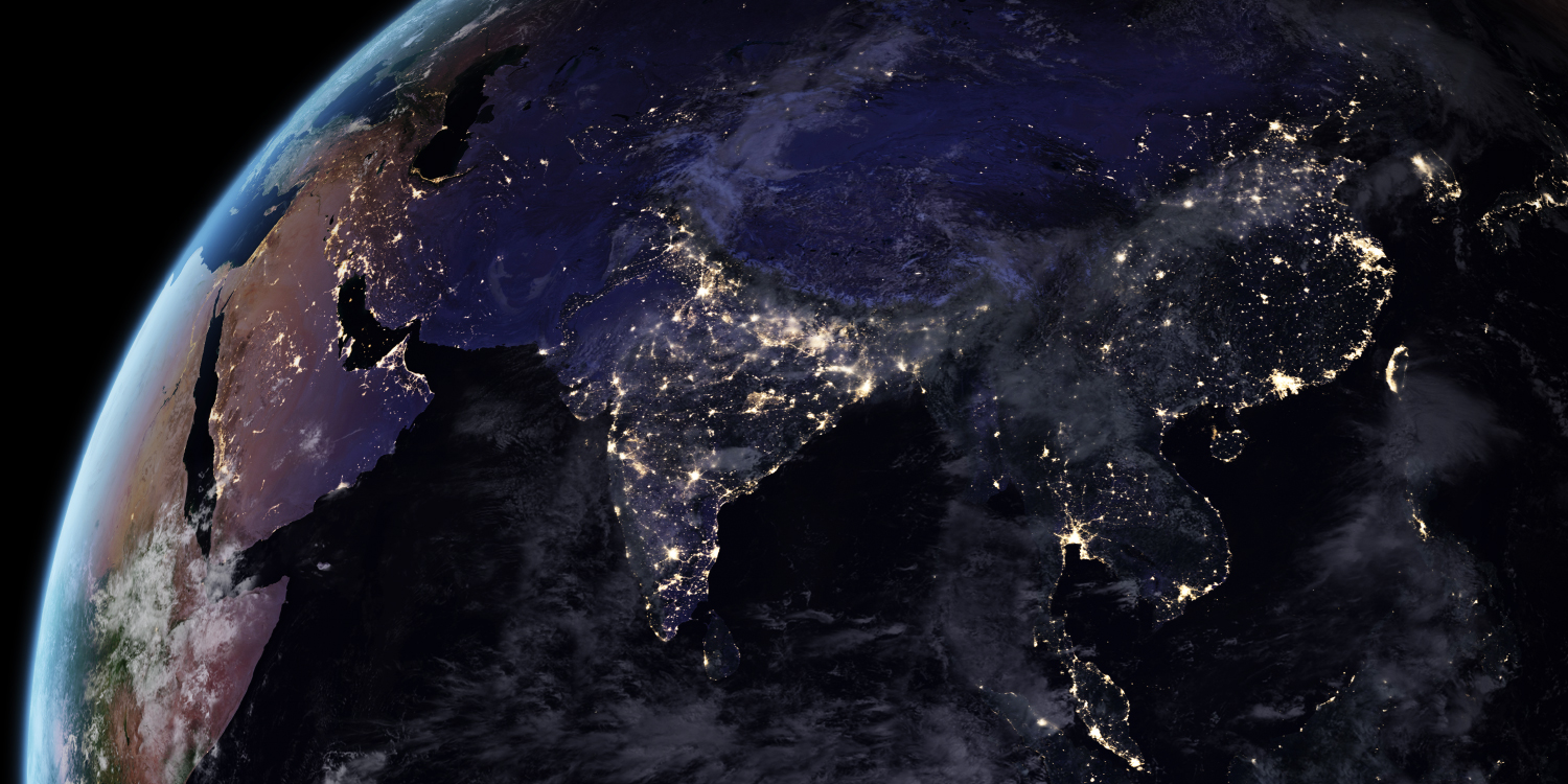
The most familiar views of Earth from space feature a blue-green planet lit by the Sun.
But in the darkness of night when the Moon, city lights, fires, or aurorae illuminate Earth, some satellites continue to gather images of light. And they are fantastic!
So how does such imagery come to be? Let’s take a look!
Topographic Diversity of the Contiguous USA
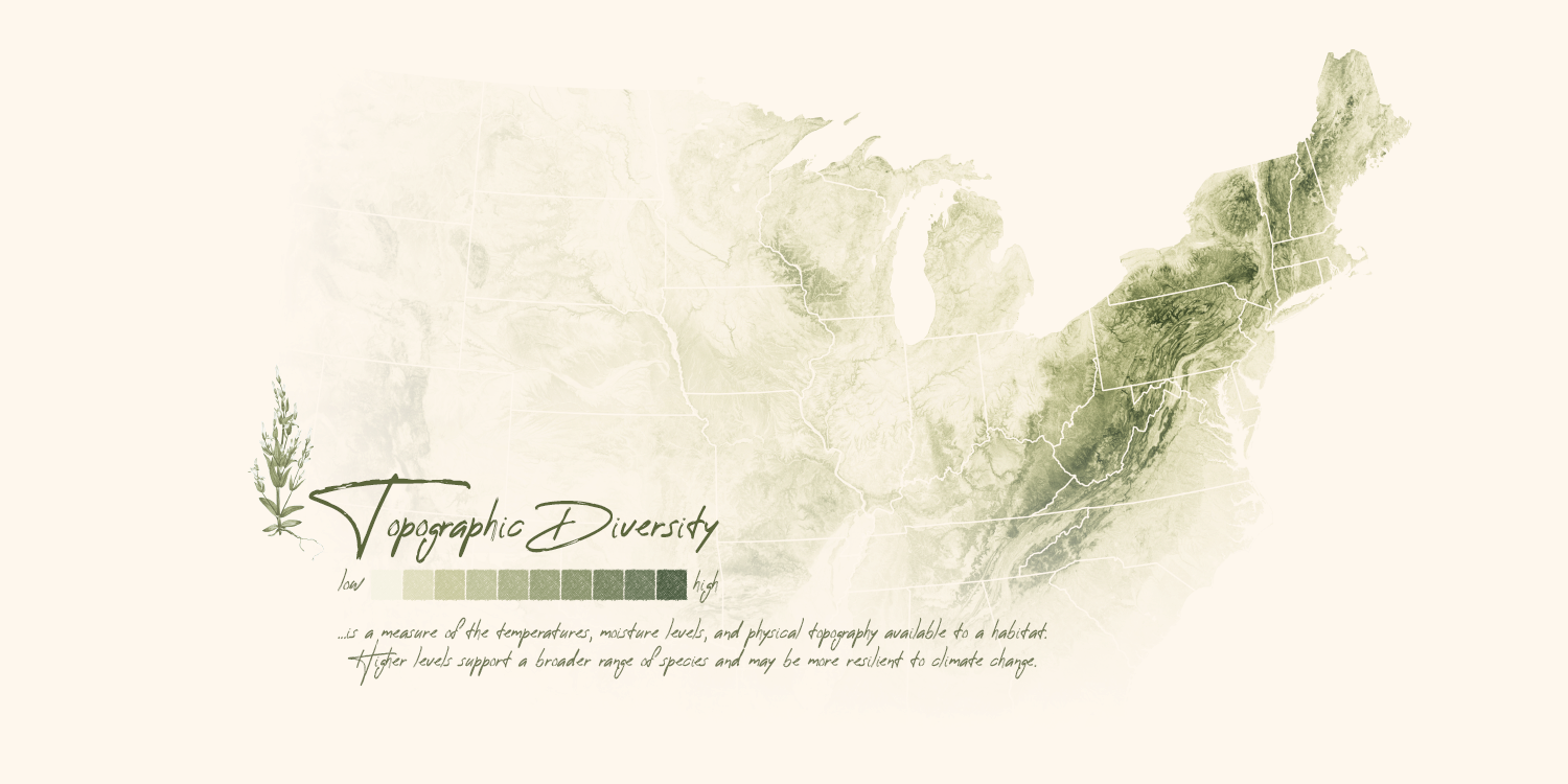
While exploring data offered within Google Earth Engine (as I am wont to do), I came across a gorgeous and elegant layer from the U.S. Geological Survey.
This data, which represents “topographic diversity,” immediately conveys exactly what it aims to: topography. But the ridges and valleys are not representative of Earth’s bumpy surface alone.
3D Models from NASA
Just Add a Rendering Engine!
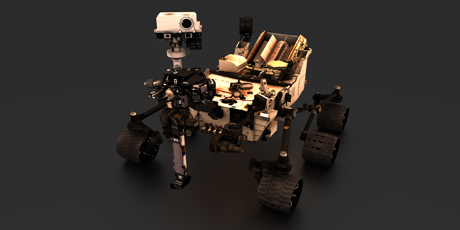
You’re probably well aware that NASA has launched numerous spacecraft—some destined for orbit, others to land on distant planets, and some to initiate a galactic handshake beyond our solar system.
Many of these missions have corresponding 3D models. What’s more, NASA has made a number of these available to the public. From satellites and shuttles to rovers and crew modules, more than 300 objects are currently available to download.
Mapping the Distance to the Nearest Coastline
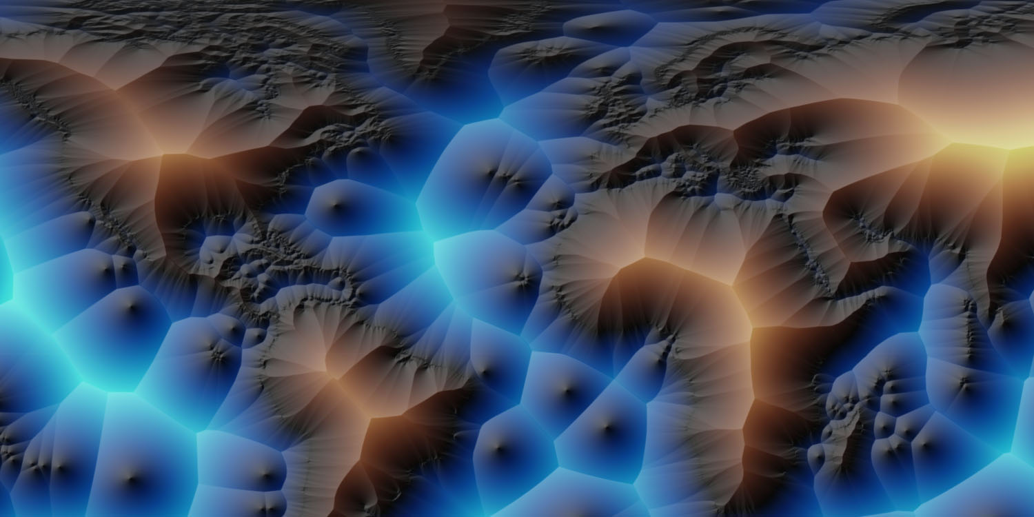
Recently, I stumbled upon a NASA dataset containing the distance to the nearest coastline. The data are a rather straightforward calculation based on input from GSHHG—the Global Self-consistent, Hierarchical, High-resolution Geography Database.
Provided as a convenient GeoTIFF, the coastline distances are available in 0.04° and 0.01° resolutions. This makes it ideal for quick exploration. Or a dive down geographic rabbit holes.
Glen Canyon National Recreation Area
A Modern Rendering of an American Landmark
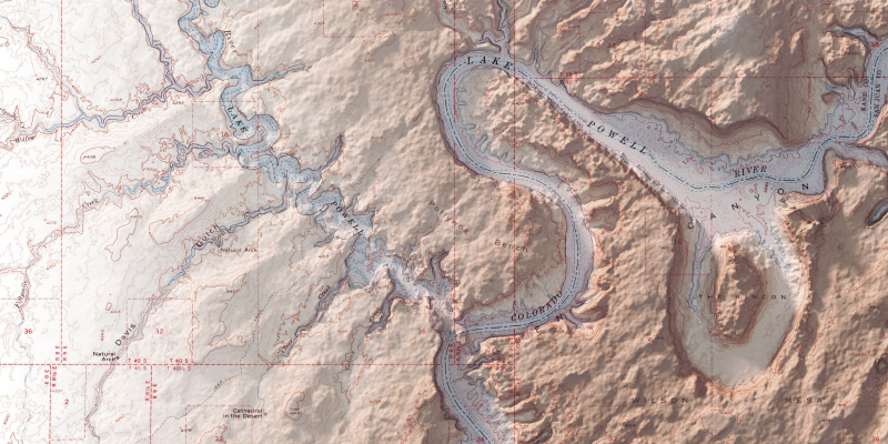
One of my favorite places to see in imagery and maps is Glen Canyon National Recreation Area and The Rincon. Here, water meets stone as myriad canyons reach out from the serpentine courses of the Colorado and Escalante Rivers.