Mapping Ukraine's Refugees
A Defense of Proportional Arrows from Geography's Radical Past
Disasters are the great catalysts of cartography. There is no stronger impetus for new maps than earthquakes, landslides, floods… and wars.
With new maps come new desires. The field of cartography has come a long way, and both its practitioners and students have learned a great deal. Myriad data sources are within an ever-closer grasp, and we’ve learned to approach each with more care, more diligence, and more responsibility.
That’s precisely what James Cheshire calls for in his insightful and illuminating critique on recent maps of the Ukrainian refugee crisis. His post offers a well-reasoned critique of the maps that typify human migrations of many sorts, as well as a nice collection of maps that attempt to correct the described wrongs. James asks us to carefully reflect on the purpose of a map, who it’s for, and how it will be displayed. It’s all around a phenomenal post that raises many important points.
I don’t want to revisit every point James (and others in the broader discussion) have brought up. But I would like to make the case for arrows in three points.
1. Directionality
While there are valid critiques of proportional arrow maps, I have yet to see an alternative that is remotely as intuitive.
A number of clever attempts have been made to replace arrows (see the Twitter thread here), but each sacrifices more than it contributes. For instance, the Financial Times used proportional circles with tapered lines to depict the number of refugees from Ukraine. Circles concisely represent values in a way proportional arrows do not, but now the movement is vague: The origin-destination relationship is broken, now working in both directions. This is a gorgeous map, but the split second it requires to understand the circles are people leaving Ukraine is small in measured time, but enormous in value. The flight from Ukraine is the heart of this data and should be the first thing readers notice. One might argue the context is known before someone even looks at the map. That may be true now, but it might not be true when the event is not the top of the headlines. Clear design should not be so temporally tethered to a specific event that the map loses clarity as time progresses.
Arrows are immediately obvious to the reader, clearly showing movement from one location to another.
2. Color
There has been some discussion on the color used for the arrows, especially those used in the BBC’s original map. (The map with arrows has been replaced with a table—likely as a result of the commentary. This is a step backwards.)
Perhaps the weakest of the critiques of arrows in the broader discussion, the color argument is a non-starter for me. What color is a migration of people? What color should a migration of people not be? There simply is no objective answer to these questions. And indeed associating value to various colors has been a fraught attempt ever since Johann Wolfgang von Goethe first suggested it could be done.
I don’t think the color of the arrows can be easily critiqued. While blue may appear to connote a flood to one reader, green might suggest greed to another. More likely than not, the color of the arrow (or circles) will be one that compliments a publisher’s established style guide.
Nonetheless, color can still be used to great effect. I am immediately reminded of the work of Bill Bunge, in particular his Nuclear War Atlas published in 1982.
Bunge's Nuclear War Atlas features a collection of maps that are as varied as the social commentary that weaves through them.
With just a few shades and a single color, Bunge designed some of the most iconic and striking maps to anyone familiar with his work. But it’s not just his maps that are relevant here. Current events also call to mind Bunge’s writing:
Interestingly, geography, a subject currently in low academic status, dying out in one university after another, can actually make a serious claim to be the ‘queen of the peace sciences’ — not out of our innocence, but rather out of our guilt. It is the quintessential war science. This might account for its decline. Today, who needs more expertise on how to kill people?
Bunge used color sparingly, and as a result, effectively.
Many of the maps created in response to the arrow debate have chosen muted, natural colors. The maps are aesthetically pleasing, easy to look at, and well-designed. But as I asked on Twitter: “Who benefits when we make such maps more palatable, more human, and safe to look at?”
These maps show the consequence of war. It is bad. It is uncomfortable. It is painful. To mask those facts is to adopt the language of the aggressor(s).
Such maps should not be the visual equivalent of easy listening.
3. Humanity
Closely related to the last point, the chief complaint against the proportional arrows is their lack of humanity. That is, in their pursuit of intuitiveness, arrows can—largely accidentally—become metaphorically crass or informationally oversold. Bold, vibrant arrows might imply the refugees are “invading” or “swarming” their neighbors. When drawn with too much character, arrows can imply city-to-city precision, or the taking of specific routes, unsupported by the data.
But with these critiques, and Bunge’s work, in mind I believe arrows can be made effective in the following ways:
- Arrows should immediately clarify a to-from relationship.
- Remove color from the arrows entirely. Even if color connotations are hand-wavy at best, there’s nothing to be gained by even trying.
- Do not start the arrows in the middle of the map, where they seem disjointed and distant from the map itself.
- Use color sparingly and strikingly. Muted, safe colors make maps too visually pleasing.
- Arrows should cross the borders by bringing the foreground color with them. Refugees don’t simply flee a country—they bring their country, their culture, and their history with them. (Perhaps it is the lack of color that can make arrows seem more human?)
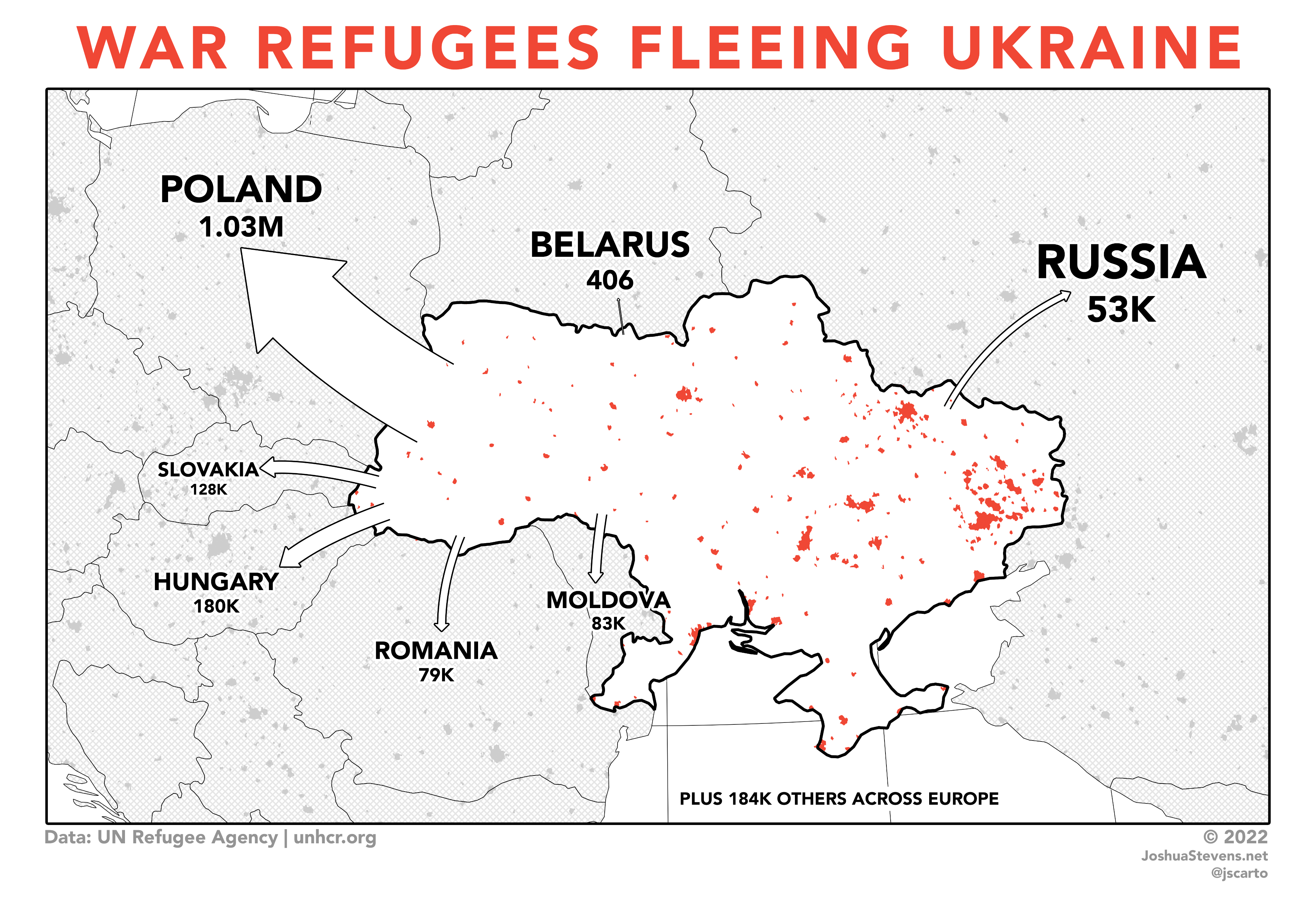
The final map, inspired by the work of Bill Bunge.
View larger
I believe the map above effectively communicates the situation. Though like any map, it is not perfect. And I don’t believe it is even the best approach. But arrows are intuitive and we should not be too quick to close the door on something that—with a little care—works well.
The conversation kicked off by James’ post is a nice reminder that there is still a lot of innovating to do in cartography—and sometimes we must look back to go forward.