 Joshua Stevens
Blog
Notes on maps & visual storytelling
Tutorials, breakdowns, and essays on cartography, remote sensing, and data visualization.
February 12, 2019
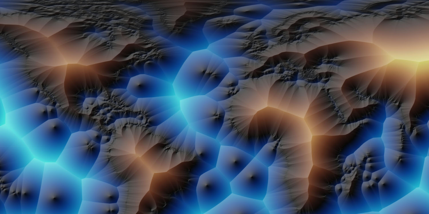
Mapping the Distance to the Nearest Coastline
Recently, I stumbled upon a NASA dataset containing the distance to the nearest coastline. The data are a rather straightforward calculation based on input from GSHHG—the Global Self-consistent, Hierarchical, High-resolution Geography Database. Provided as a convenient GeoTIFF, the coastline distances are available in 0.04° and 0.01° resolutions. This makes it ideal for quick exploration. Or a dive down geographic rabbit holes.
January 27, 2019
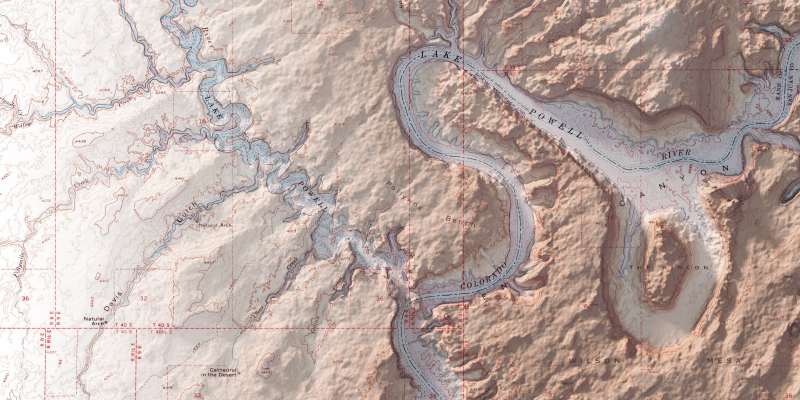
Glen Canyon National Recreation Area
One of my favorite places to see in imagery and maps is Glen Canyon National Recreation Area and The Rincon. Here, water meets stone as myriad canyons reach out from the serpentine courses of the Colorado and Escalante Rivers.
January 23, 2019
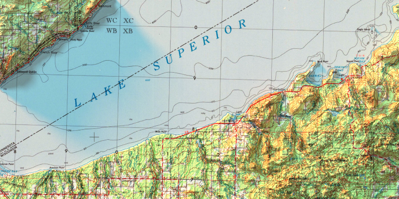
Tactile Topography
There’s something special about topographic maps. Each is different than the next, yet many reflect a canvas replete with smooth contours, pleasing colors, and a technical accuracy that can send both the mind and feet wandering. It is hard to imagine improving the natural aesthetic that topographic maps tend to convey.
October 28, 2018
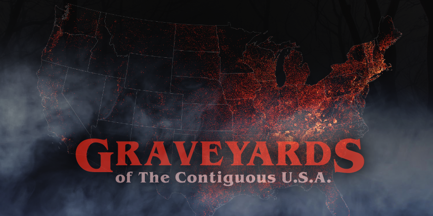
Graveyards of The Contiguous USA
Lately I have been challenging myself to read more fiction. The most recent book to be checked off my list is Stephen King’s Pet Sematary. A morbid and suffocatingly dark story, and one I had previously only known from seeing the 1989 film as a kid. (Yes, the book is better. By a long shot!)
October 17, 2018
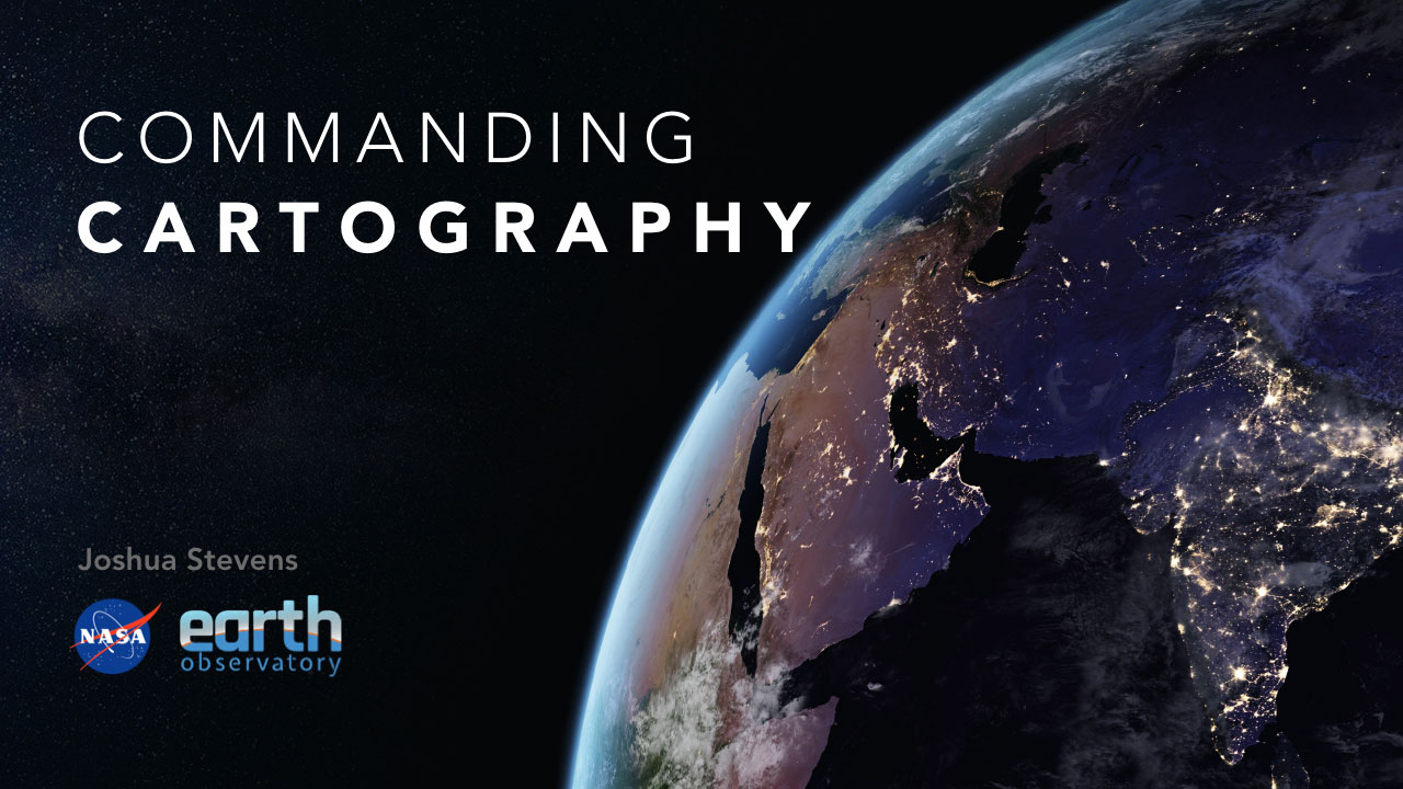
Commanding Cartography
Compelling cartography has never been easier or more abundant. We are inundated with new tools and technologies. All the while, one of the most powerful assets in the cartographer’s arsenal is being overlooked: the command line. Using keystrokes to create maps might sound like a task of yesteryear, but I am here to tell you it is a wormhole to the future. Whether you design maps for national parks or newsrooms, the terminal will enable you to supercharge your workflows with speed and elegance. This talk introduced some old tricks and new tools for designers on any deadline.

February 4, 2018
Landsat Fact Meets Fiction in Kong: Skull Island
In Kong: Skull Island, we follow a crew of scientists and military specialists into the thick jungles of an uncharted Pacific island. Encounters with previously unknown creatures abound. Released in 2017, the film is set in 1973 and prominently features a fictional company—Landsat—whose work involves classified satellite data. But is it all fiction?

October 16, 2017
Now on Hugo
A few years ago I made the move from Wordpress to static pages. The benefits were immediate, and it has been nice not worrying about plugins, security patches, or millions of updates since.
February 18, 2015
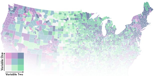
Bivariate Choropleth Maps: A How-to Guide
“I’m not bivariate, but I am curious.” That quip has been stuck in my mind ever since I overheard it at the 2013 NACIS conference in Greenville, SC. Not only was it perfectly timed after a talk about bivariate mapping, but it rang with a great deal of truth: a lot of folks aren’t creating bivariate maps, but they want to try. While it was just a joke and the person who made it can easily create bivariate maps, most people find them too difficult or mysterious. That’s a real shame because bivariate choropleth maps are incredibly useful and very easy to make. So let’s go ahead and make one!
February 8, 2015
The Ebb and Flow of Polar Sea Ice
In some very real ways, polar sea ice is the backbone of our planet’s climate. When more ice is present, its bright surface tends to reflect sunlight, cooling things down. When there is less white, snow-covered ice, the ocean’s surface becomes a bit darker. A darker ocean surface absorbs more sunlight, causing it to warm. The relationships between climate and ice are much more complicated than that, as the thickness of the ice also influences a variety of subsurface feedback loops that have long-term effects.
August 8, 2014
HDRI Lighting for Shaded Relief Maps
Shaded relief maps are among my favorite of all map types. Not only do they form the foundation for many other maps and derivative layers, they present a fascinating challenge: depicting an abstraction of terrain in a natural way while balancing accuracy with aesthetics. This push and pull between modeling a natural phenomenon (the illumination of Earth and the shadows cast by the sun) with artistic purposes has captivated cartographers for centuries. It’s no surprise that as technology advanced, so too did the modeling of the sun’s rays. With this in mind, I wondered how techniques in 3D ray tracing carry over to shaded relief mapping.