The Ebb and Flow of Polar Sea Ice
In some very real ways, polar sea ice is the backbone of our planet’s climate. When more ice is present, its bright surface tends to reflect sunlight, cooling things down. When there is less white, snow-covered ice, the ocean’s surface becomes a bit darker. A darker ocean surface absorbs more sunlight, causing it to warm. The relationships between climate and ice are much more complicated than that, as the thickness of the ice also influences a variety of subsurface feedback loops that have long-term effects.
But one thing is clear: the expansion and retreat of polar sea ice is cyclic. In the winter months, arctic sea ice grows. During the same time, antarctic ice in the south pole shrinks. In the summer, these trends reverse. This ebb and flow, like the breathing of a living planet, happens every single year.
Scientists have been monitoring that ‘breathing’ pattern for decades, looking for changes in cycles that occur over many, many years. By measuring the rate of the ‘inhales’ (ice growth in the north pole/loss of ice in the south pole) and ‘exhales’ (ice loss in the north pole/growth in the south pole), we can track the long-term health of the climate.
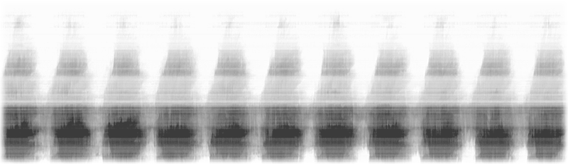
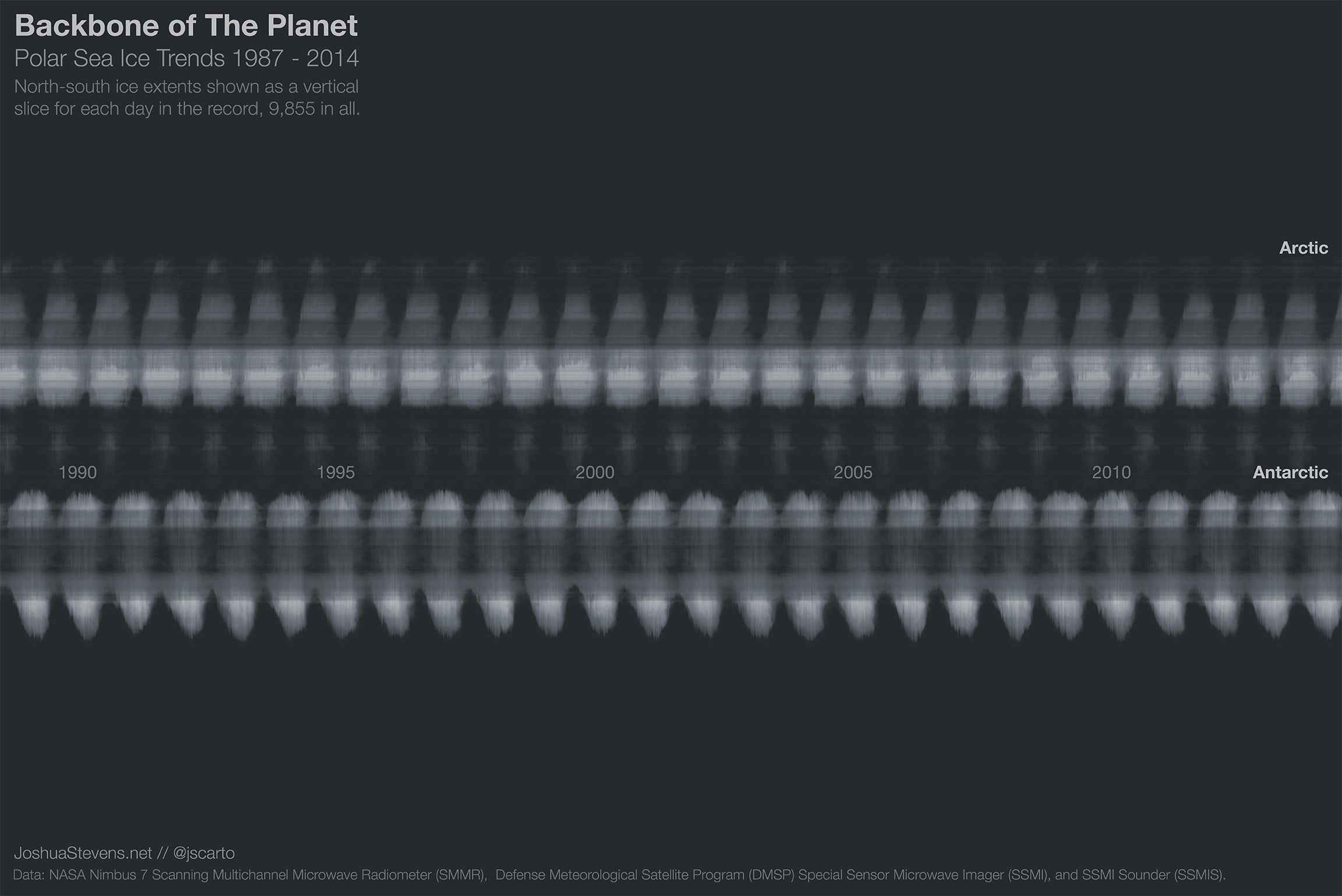
For the past few days, I’ve been creating maps and charts of polar sea ice using data from instruments aboard NASA’s Nimbus 7 satellite. In total, these data feature 19,710 daily records of geographic ice extents - 9,855 for each of the two poles. That’s far too many maps to fit in your browser. Even if the maps were an animated sequence - at the standard 24 frames-per-second, the animation would be almost 7 minutes long.
Instead, I wanted to show all of the data at once.
To make that happen, I first generated all 19,710 daily maps. I then smooshed each map horizontally, simplifying the maps to a 1-pixel-wide snapshot of the poles’ maximum north-south sea ice extent for that day. Each pixel strip was then stitched together, side-by-side.
This was the result:
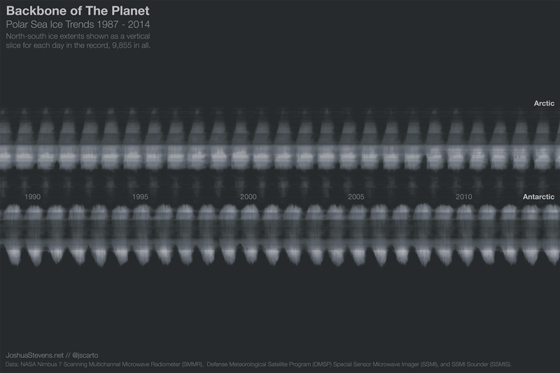
The image above has been scaled down significantly. The super mega wide original depicts each day as a 1-pixel wide slice, making it 9,855 pixels long. For a hi-res version that is still reasonably sized for your browser, click here.
The cyclic pattern of each pole is evident - as is the alignment of each pole’s individual cycle. The waxing of one pole almost perfectly pairs with the waning of the other. A climatic system that looks like breathing when viewed annually appears as interlocked, vertebrae-like structures in the long view.
It’s as if Earth had bones.