Bivariate Choropleth Maps: A How-to Guide
“I’m not bivariate, but I am curious.” That quip has been stuck in my mind ever since I overheard it at the 2013 NACIS conference in Greenville, SC. Not only was it perfectly timed after a talk about bivariate mapping, but it rang with a great deal of truth: a lot of folks aren’t creating bivariate maps, but they want to try. While it was just a joke and the person who made it can easily create bivariate maps, most people find them too difficult or mysterious.
That’s a real shame because bivariate choropleth maps are incredibly useful and very easy to make. So let’s go ahead and make one!
Synopsis: This post introduces the idea of bivariate choropleth mapping and demonstrates a technique for creating your own. Although I show some screenshots from QGIS, emphasis is placed on the concepts of the method rather than any particular tool or language. This technique will work with any software you prefer! A graphics program like Photoshop, Illustrator, Inkscape, or similar will be helpful if you choose to also create your own color scheme.
What is a Bivariate Choropleth Map, Anyway?
First things first: Univariate Choropleth Maps
Before we make a bivariate choropleth map, let’s quickly cover the concept of univariate choropleth maps. Done correctly, basic choropleth maps use color to show quantities within geographic areas - such as states, US counties, or even countries. The term choropleth derives from Greek: choro (area) + plethos (multitude). The example below shows a typical choropleth map:
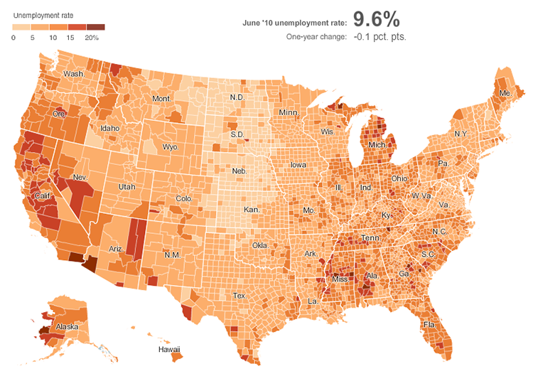
A univariate choropleth map of unemployment rates in the United States. Source: The New York Times.
Normalize, normalize, normalize!
Notice that the map above uses unemployment rates, and not the total number of unemployed people. The use of proportions, or rates, instead of raw counts is fundamental to creating a proper choropleth map. If the map above used a raw count of the total number of unemployed people for each county, it would be subject to bias introduced by the size of each county. Larger geographic areas tend to have more people by virtue of having more space for people to live in. Using raw counts would show that: unemployment would seem higher in larger counties, not because unemployment is more common there but simply because there are more people there. That wouldn’t make a very interesting map.
Instead, choropleth maps should be normalized. The process of normalization accounts for differences in geographic areas by converting raw counts to rates or proportions. Population density is a great example of normalized data. It represents the number of persons per unit of geographic area (often square miles or kilometers).
When social data are not normalized, they tend to reflect trends in where people live rather than interesting variations in the phenomena of interest. Obligatory XKCD.
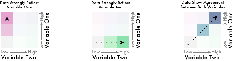
Bivariate Choropleths: Mostly The Same, Now More Variate
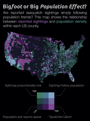
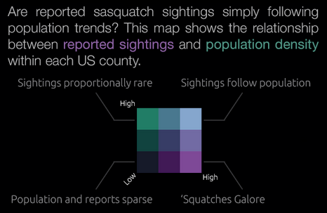
Bivariate choropleths follow the same concept, except they show two variables at once. For example, the inset map in my visualization of bigfoot sightings is a bivariate choropleth of sightings and population density:
Ideally, you should at least have a hunch two variables are related when creating bivariate choropleth maps. This is because bivariate maps go further than simply showing two variables all willy nilly: they show where those two variables tend to be in agreement or disagreement. If there is no expectation that the two variables might be related, a bivariate choropleth is not the right choice.
Showing the agreement between two variables is also why the number of classes in a bivariate choropleth is larger than the combined sum of classes in each variable alone. In general, if the individual variables have n classes, the bivariate choropleth map will have n2 classes.
And then there were nine: Combining two 3-class univariate maps produces one 9-class bivariate map.
Most cartographers advise against maps with 9 or more classes. Thus it is recommended to keep things super simple when creating bivariate choropleth maps by not exceeding 3 classes in each variable.
Neat. So How Are These Things Made?
When making a bivariate choropleth map, the goal is to show a sequence of two variables and their combinations. I find it easiest to think through these relationships with something visual to refer to. So the first thing I do is create (or choose) a color scheme.
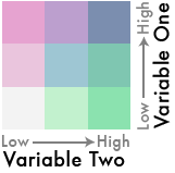
Start With a Legend
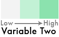
Remember that bivariate maps have a lot going on, so it is best to keep things simple to start with. We don’t want to exceed 9 classes total, so we’re going to have each variable step through only 3 classes.
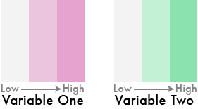
1) Begin by creating a 3-class sequential color scheme for one of your variables. The color scheme should begin with a very light, neutral color that will represent the lows for the first variable. The color scheme gradually becomes darker and more saturated towards a hue of your choice that will represent the highs. The middle color should be the same hue as the end color, but its saturation should be lower while the brightness is higher:
Keep it simple: Use a single hue, with increasing saturation and value (darkness).
2) Now do the same for the other variable. This time, choose a hue that is quite different from the first. Choosing a complementary color can be a good start. But make sure to go slightly off center of complementary by picking a neighbor to the complement. This will give your final scheme a better shot at being colorblind-safe (you can fine-tune the final color scheme later to help with this).
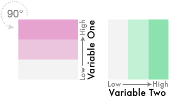
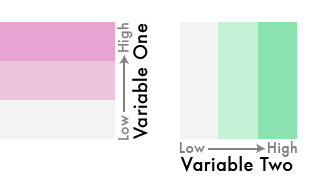
3) So far, we have colors to represent 6 classes, but we need 9. To do that, turn each of the rectangular color schemes into squares by stretching (or duplicating) them vertically, like so:
4) Now take the color scheme for the first variable and rotate it 90° counter-clockwise so that the neutral (low) color is on the bottom and the high is on top:
5) This is where the magic happens. In Photoshop, Illustrator, or another capable graphics program, change the blending mode of the first color scheme to darken. Then position the first color scheme so that it perfectly overlays the second one. Suddenly, a new palette emerges revealing both variables:
The first color scheme now mixes with and darkens the colors beneath it, creating a 9-class bivariate color scheme. Experiment with other blending modes. 'Multiply' also works well.
6) Almost there. We now have a 9-class bivariate sequential color scheme, but it needs a little more work. The top right cell of this grid - the dark blue color - represents cases when both variables are high. As such, it should be the most salient color in the palette. To make that happen, let’s increase its saturation a bit. We’ll also adjust the color of the central cell, bringing its hue closer to the corner blue to further distinguish it as a mix of the two variables:
That step takes some practice. If you’ve been following along with different color choices, you’ll have to tweak things a bit differently from what is shown here. But the goal is the same: the color scheme should clarify relationships in the data along three paths, each sequentially arranged to increase in both saturation and darkness:
With a color scheme in hand, it’s time to classify the data and bring this thing to life.
Classify Your Data
Most GIS and visualization tools only let you select one attribute for classification. So how in the world could we get it to use two variables? Easy peasy: create a third attribute that represents the combination of the two variables by its location in the bivariate color scheme.
The most straightforward way to do this is to simply label the cells of the color palette. Mark cells in horizontal order with A, B, or C. Then mark the cells in vertical order with 1, 2, or 3:
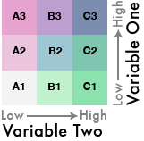
Labeled like this, the lowest value for both variables becomes A1, while the cell that represents the max for both becomes C3. Any combination of the two variables can be identified by its position in the color scheme. We now have a labeling system that the GIS can use as categories to symbolize the data.
This is where my examples become specific to QGIS, but the same approach can be applied to ArcGIS or any other software.
1) The first thing to do is go into the symbology properties as if you were making a standard choropleth map using your first variable. Don’t worry about the colors - just the classification. Choose whichever classification method works best for your purposes. (Need help choosing a classification method? John Nelson has a great overview of common methods.)
Change the number of classes to 3 and record the breakpoints:
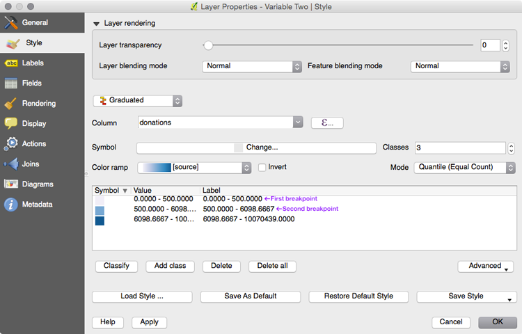
My 'variable one' classified into 3 groups in QGIS. For the curious: these data represent donations to Obama's campaign in 2012.
Using the information in the screenshot above, the breakpoints are 500.00 and 6098.66.
2) Now create a new field in your attribute table. This is going to record the class for the first variable, which goes vertically in our color palette from 1 to 3. In other words, the new field will convert the actual data values into a 1, 2, or 3. This is done using the breakpoints found in Step 1 above.
Add a new integer column to the attribute table named Var1_Class. To populate it with the proper information, use the field calculator with the following expression (replace “donations” with the field name of your first variable, and using your own breakpoints):
CASE WHEN  "donations" > 6098.66 THEN 3
	WHEN "donations" <= 6098.66 AND "donations" > 500.00 THEN 2
	ELSE 1
END
This works in QGIS, but you'll have to alter the syntax and approach based on your software of choice.
3) Repeat steps 1 & 2 above for the second variable, using its own breakpoints found in the same way. This time, add a new string column called Var2_Class and populate it with the characters A, B, or C (change “perInsured” to the name of your variable two, and replace the breakpoints with your own):
CASE WHEN  "perInsured" > 86  THEN 'C'
	WHEN "perInsured" <= 86 and "perInsured" > 50 THEN 'B'
	ELSE 'A'
END
After performing these steps, you should now have two new fields in your attribute table representing numbers 1-3 and characters A-C:
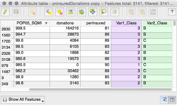
The first 10 records of my attribute table, with new fields (highlighted) showing the ranking for our labeling system.
4) All the necessary information is now in the attribute table. The last trick is to simply combine the new fields into one. This last column will represent the data’s position in the bivariate color scheme.
To combine the columns, create a new string field called Bi_Class. Then using the field calculator, enter the expression below:
concat("Var2_Class",tostring("Var1_Class"))
This fills the new column with information that identifies which cell in the bivariate color scheme to use when symbolizing the data:
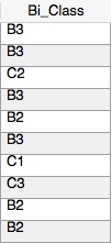
The database now has entries pairing the variables with their position in the bivariate color scheme.
5) The final step is the easiest! Simply symbolize the map as a categorized choropleth using Bi_Class as the data column. Refer to the labeled color palette to know which class gets which color:
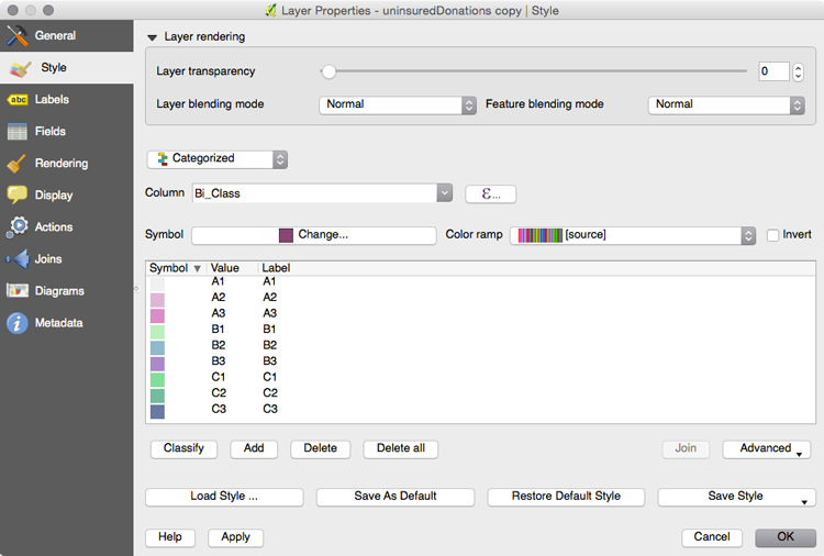
Tip: If you're using QGIS, use the 'eye dropper' tool to copy each color from the palette over to the appropriate value in the style window.
Et Voila!
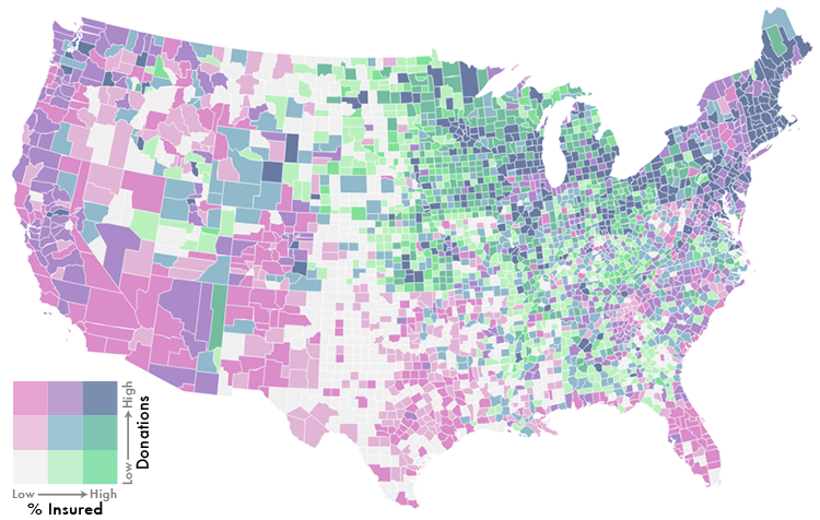
The final 9-class bivariate map. Each bivariate class identifier is recorded in the GIS.
Closing Tips, Caveats, and Other Hand Waving
Tips
Bivariate data is often complicated and can confuse your readers. Keep this in mind and strive for simplicity. Don’t weight your legend down with too many decimal points and raw numbers - try to emphasize relative rankings.
You can simplify things further by color coding the variables in the description. Then only label the corners of the bivariate legend. These are the most interesting scenarios on the map, and the intermediaries become obvious.
The corner cases are what make bivariate maps interesting. Help your readers understand what they mean.
Also consider the overall design of your map. If you’re designing for a dark background, the neutral color in your palette should also be dark. The color schemes for each variable should then increase in lightness instead of darkness.
A similar type of mapping you should also be aware of is called value-by-alpha mapping. It was developed as a spatially accurate alternative to cartograms, though it shares some similarities with traditional bivariate choropleths.
Caveats
There’s a reason ColorBrewer doesn’t provide handfuls of bivariate color schemes. If you try to make bivariate color schemes that are simultaneously colorblind-safe, photocopy-safe, and print friendly…you’re going to have a bad time.
When developing bivariate color schemes, which generally have three hues, you’ll likely have to forgo at least two of the properties ColorBrewer was designed to support. A bivariate color scheme is inherently more difficult to balance in this regard than a univariate palette that steps through only one or two hues.
A colorblind-safe example of a bivariate color scheme can be found in the first map of Cindy Brewer’s older reference on color here.
If you absolutely need to ensure your map is colorblind-safe, use the top color scheme in the above link. My color scheme used throughout this post will work, too. You may also want to consider other bivariate approaches - or whether a bivariate approach is sensible at all. With interactivity and small multiples as easy options, it is not always necessary (or even desirable) to show two or more variables at once.
Hand Waving
“Wait!!” I hear you say. “If I can overlay two color palettes to create a bivariate color scheme, can’t I just do that with the full maps?!”
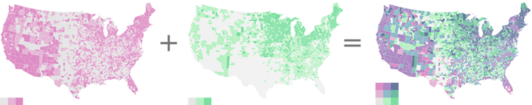
Yes. Yes you can. If you’re creating a quick one-off map, overlaying two univariate choropleths as you would the color palettes will instantly create a bivariate choropleth map. You can skip all the data manipulation and rely on color chemistry alone.
Here’s why I don’t recommend that as the go-to method: Let’s say you create a bivariate choropleth by overlaying two univariate choropleths. Everything looks good, but you’re not happy with the color of the center cell in the palette. Since that color was the haphazard result of mixing entire maps, you’ll have to tweak one (or both) of the maps and overlay them again. This time, you might get the color right while adversely affecting the others. You’re now in a cat-and-mouse game with color choices, relying on trial-and-error for a fix.
By storing the information in the database, you can easily apply a new color scheme or make changes to any single class without affecting the others. You have full control over each individual color, allowing you to fine-tune things to your liking. More importantly, you can query the database on this information for further analysis and statistics. That’s an enormous advantage that can’t be overstated.
The other glaring problem with overlaying two entire maps however is that it is limited to static maps. A data-driven approach is the way to go for web mapping and interactives. Rendering two separate maps in a browser to produce a color scheme is crazy talk. Render a single map, with the colors you precisely define, and save yourself a lot of time (and sanity)!
It’s Dangerous To Go Alone! Take This.
I’ve made a few sequential bivariate color schemes you’re free to use if you’d rather not make one yourself. They were designed for use on light backgrounds.
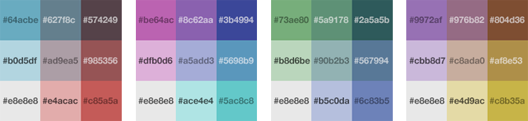
These example palettes should get you off to a good start.
Further Reading and Other Examples
- Sequential-sequential bivariate color scheme examples and overview by Cindy Brewer.
- Color Use Guidelines for Mapping and Visualization by Cindy Brewer.
- Value-by-Alpha Maps by Andy Woodruff (technique developed with help from Rob Roth and Zach Johnson. You can find their full paper here).
- IndieMapper, a Flash app that helps you design maps in your browser. Among many other great features, it supports bivariate choropleths.
- ArcGIS Bivariate Mapping Tools by Aileen Buckley. It includes Esri’s collection of bivariate color schemes. Also check out this blog post by Kenneth Field on new transparency options in ArcGIS Pro.
- Symbol Considerations for Bivariate Thematic Mapping (PDF) a thesis on bivariate mapping by Martin Elmer.
If you make a sweet map using this tutorial, or have questions about it, drop me a line and let me know!