Page 3 of 3
Moving from WordPress to Middleman

Note: In September 2017 this site was rebuilt with Hugo. The text below no longer describes my own site, but I would still use Middleman (or any other static generator) over WordPress.
Recently I’ve spent a few evenings removing WordPress and rebuilding this site on top of Middleman. The new site is still a work in progress and I have more features to add, but all of the previous content has been brought over. It should be safe to launch this.
So why did I do it? Over the past two years I’ve become increasingly frustrated with WordPress. Despite serving compressed pages, caching data, and reducing unnecessary scripts, page load times seemed to increase with each new version. Some of my more popular pages were averaging 5 seconds to load. That’s ridiculous.
Even when WordPress itself performed well, it required additional plugins just to have reasonable features (e.g., caching, contact forms, spam protection, SEO optimization, etc.). Each of these requires constant updates, and one can never be sure if updating one plugin is going to break other plugins, or worse, the entire site. Compatibility reports from other users are helpful, but are often incomplete. Logging in just to write a simple post became a chore: update this, double check that, fix this other thing that the previous update broke, and so on. Long story short, it got old.
The Many Birthplaces of Memorial Day
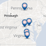
Yesterday was Memorial Day. Like many other Americans, my family and I spent this day of national remembrance at a local park. We made the short trip to historic Boalsburg. Those in the know will recognize that Memorial Day in Boalsburg, PA is no ordinary affair. It is a massive celebration. This was especially true this year, which marks the 150th Memorial Day celebrated in Boalsburg. Thousands of people from all over gathered to honor our veterans who gave the ultimate sacrifice. What started as a time to decorate graves with flowers has now grown into a large festival, with celebratory events found at every corner of the township.
It was also a learning opportunity. Almost everyone knows about Pennsylvania’s vital role in the Civil War and the importance of Memorial Day in the region. As a Michigan native, what I didn’t know was that Boalsburg itself was the very birthplace of Memorial Day.
The Map of GDELT Predictions in Afghanistan as You Should Have Seen It
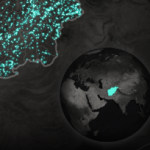
For the last several weeks, I’ve been creating a visualization of past and predicted conflicts in Afghanistan. The data, which come from a statistical model developed by Jay Yonamine with help from John Beieler, show us what might happen based on a long history of what has happened. The database behind this model is known as GDELT, or the Global Database of Events, Language, and Tone. GDELT has received a lot of attention lately and I’ve participated in two hackathons that have emerged around it. After Wired showed interest in publishing this story along with the visualization, I was thrilled.
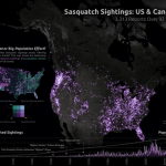
'Squatch Watch: 92 Years of Bigfoot Sightings in the US and Canada
Every now and then a dataset comes along that just has to be mapped. This is one of those times.
Bigfoot. Sasquatch. Skookum. Yahoo. Whatever you call it, the towering man-like ape is a folklore staple. From stories of Yeti in the Himalayas to Wildmen in the Pacific Northwest, people have been talking about and trying to find the creature for ages. Occasionally, some form of evidence – like Patterson’s famous 1967 film – emerges and either feeds our fascination or gets dismissed as a hoax. In either case, it’s easy to see why believers search for proof and skeptics remain doubtful.
Through archival work and reports submitted directly to their website, the Bigfoot Field Researchers Organization has amassed a database of thousands of sasquatch sightings. Each report is geocoded and timestamped. Occasionally, even photos and videos of the alleged evidence are included. I’m not quite sure how I stumbled across this, but I’m glad I did.
After crawling the data and converting it to a more convenient format, I mapped and graphed all 3,313 sightings that were reported from 1921 to 2013:
Your Favorite Traffic Map is Lying to You
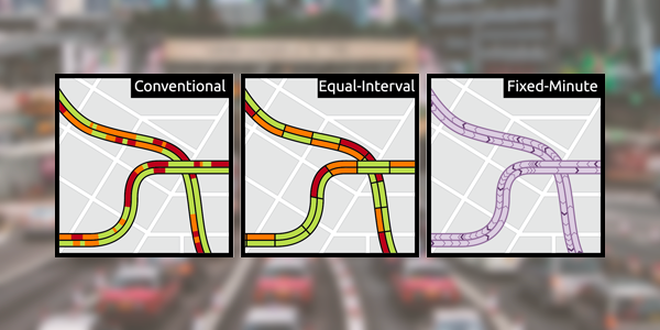
Traffic maps are among the most widely used maps available today. Whether they are accessed through a web browser, an app on your smartphone, or an in-vehicle navigation system, many popular maps include a traffic layer – and for good reason. The proliferation of live traffic information is extremely beneficial. With real-time congestion data we can avoid delays, plan better routes, and get to the places we need to be when we need to be there. Traffic maps simplify this process and clarify the costs and benefits associated with various routes.
Big Data Social Science Video Demo: SensePlace2
This year I was selected to represent the 2013 Big Data Social Science IGERT in the annual poster and video competition hosted by the National Science Foundation. The news came as both an honor and a challenge.
Big Data Week: Geographic Visualization and a Demo of CartoDB
Spatial is special. Accordingly, there are many considerations that need to be made prior to and during the task of visualizing spatial data. Chief among these considerations are your goals and what it is you’re actually trying to accomplish with a map. Are you communicating results you’ve already found? Enabling users to explore the data to discover information on their own, possibly generating new hypotheses?
Accommodating Big Data in Visual Analytics
Last week I had a blast visiting Santa Barbara and Los Angeles. While I enjoyed the wineries and sunshine, the annual meeting of the Association of American Geographers was the highlight of the trip. With so many talks on cartography, GIS, and cyber science, it was my favorite AAG conference yet.
What made AAG even more enjoyable was the acknowledgement of big data within GIS (though I’d argue we’ve all been doing “big data” for decades now).
Big Data Social Science Poster Session
As part of the NSF IGERT in Big Data Social Science, Pond Lab hosted a public poster session this afternoon.
A total of eleven different posters were presented, covering topics in big data that ranged from text processing and visualizing uncertainty to computing voter sentiment and analyzing data of patients’ heart rates.
I presented work on a GeoVISTA project that leverages geovisual analytics and Twitter to help users make sense of the spatiotemporal variation of place and topic mentions within hundreds of millions of tweets.
Mapping Tools – Analysis and Visualization of Spatial Data
I had the pleasure of being invited to talk about mapping tools at the Hacking Science Hands on Sessions, led by professor and tech enthusiast Marcel Salathé.