Your Favorite Traffic Map is Lying to You
Traffic maps are among the most widely used maps available today. Whether they are accessed through a web browser, an app on your smartphone, or an in-vehicle navigation system, many popular maps include a traffic layer – and for good reason. The proliferation of live traffic information is extremely beneficial. With real-time congestion data we can avoid delays, plan better routes, and get to the places we need to be when we need to be there. Traffic maps simplify this process and clarify the costs and benefits associated with various routes.
Or so many think. As it turns out, conventional traffic maps don’t actually tell you how long it will take to get from point A to point B. Not only do traffic maps fail to communicate the information you’re after, the information they do communicate can be very misleading.
Most Traffic Maps are Similar
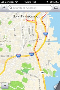
Examples of conventional traffic maps are shown below. Each is from a different source and represents the same location and time of day:
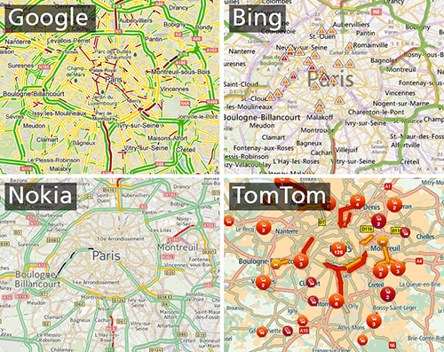
Although there are many cartographic differences between these maps, they all employ the same overall design strategy: variable length road segments in a red, yellow, and green color scheme. This design is typical of almost all traffic maps. This isn’t really surprising. For designers of traffic maps, it makes a lot of sense to base traffic map designs on a metaphor familiar to all drivers – in this case, traffic lights. A common design strategy is also something that makes a lot of sense for users. Consistency across designs makes the maps familiar, regardless of their source. Users shouldn’t have to relearn how to read maps from one vendor to the next, especially when the underlying data are the same.
Often, the designs that are ubiquitous are also those that are effective. After all, why mimic something that doesn’t work? The geographically distorted tube maps popularized by Harry Beck are a great example of an effective design mimicked the world over. The Frutiger typeface used in many airports and rail stations is another example of successful design mimicry. Sometimes though, even ineffective designs get copied and become widespread.
This is the case with traffic maps. In short, traffic maps are lying to you: their design suggests a use that cannot effectively be carried out by the user. Here’s a breakdown of the half-truths told by traffic maps and why their shared design is problematic.
Lie #1: The colors identify the fastest routes
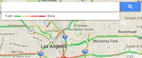
A map-based mystery: How fast is green?
When looking at a traffic map, like the one on the left, users want to see which routes are the fastest. Fortunately this is a simple task because the map makes it pretty clear: green is faster than yellow. It says so right in the legend. Right?
Here’s the problem: Which speeds are within the yellow category? How about the red category? Unless you’ve worked with the raw data, or dug deep into the chasm of documentation behind it, you won’t be able to answer that question correctly.
Some might argue that actual speeds don’t matter and yellow is obviously slower than green, so the green routes will be fastest. Unfortunately this scenario is complicated by the fact that a wide range of velocities (roughly 1 to 90mph) are broken into just three classes and spread across multiple individual segments of varying lengths. Google uses 1-24, 25-50, 50+ mph as class breaks. With these ranges, it is possible for a yellow segment to require less time to traverse than a green segment of a slightly greater length. Identifying the fastest route, which will consist of multiple segments, requires assessing every segment and the speeds they represent. But (1) the actual speed is hidden, and (2) we don’t know the lengths of the segments. Suddenly, selecting the fastest route isn’t as simple as the map suggests.
Lie #2: The colors depict routes that require less time.
This is where things get really interesting. Imagine you want to know how long a particular route will take. In order to do this, you need to know how fast you can travel and the total distance of the route. With this information, you can do the math to figure out the total time required, using the formula:
t = d/v
So far, so good. As it turns out, this math can be carried out reasonably well by users when both speed and distance are provided to them.
Things get tricky when users need to estimate distances. Consider again the maps above. How long are the particular segments represented by each little chunk of color? You’d need to be able to estimate this in order to determine the total travel time. Unfortunately, you can’t. At least not very accurately. This is because (1) each segment is a different length, (2) each length is unknown, and (3) the linear scale bar included with most maps is not adequate for non-linear route distance estimation.
The graph below shows the results of a very simple distance estimation task. We wanted to know if users can actually estimate distances along curved roads, using a standard (linear) scale bar. The exercise was repeated, with new routes, using a road map with a new, non-linear scale bar embedded into the actual transportation network.
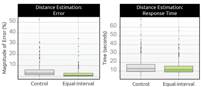
Results from a forthcoming paper. Errors in distance estimation with the conventional map compared to a map with a non-linear scale bar embedded directly into the road network.
Now consider that a given route between any two points will contain multiple segments, each representing a different distance and velocity. It’s no less than the modifiable areal unit problem run amuck. For every segment, users must try to estimate the distance, guess a velocity, and then mentally compute the travel time.
Such a scenario is not the result of good cartographic design. It leaves too much information hidden behind impossible estimations and guesswork. The map is posing questions when the user is looking for answers.
Lie #3: The red-yellow-green color scheme is best suited for a quick glance.
In order to be effective at a simple glance, the conventional traffic map design would have to depict overall delays without under- or over-exaggerating traffic conditions. If the map systematically exaggerated conditions in a particular direction (positive or negative), that suggests a design that is disjoint from the actual data. In a sense, it’s the difference between a design that is visually screaming when the data represent whispers (or vice versa), and one that is tuned appropriately to the data.
Results from our paper show that users consistently underestimate travel times when using the conventional traffic map (average underestimation of 11 minutes, which is more than 20% of the time required for most routes in the exercise). Clearly there is something about interpreting the conventional design (likely at the precognitive level) that masks the true severity of traffic conditions.
Lie #4: Red-yellow-green color schemes work for everyone.
Almost 5% of the general population has some form of colorblindness. Protanopia and deuteranopia, two common types of colorblindness, affect the way individuals see red and green due to a lack of the photo receptors necessary to interpret either hue. These conditions are collectively referred to as red-green colorblindness.
Conventional traffic maps, which rely on red and green, are utterly useless to people with red-green colorblindness. John Nelson provides the following example of the conventional traffic maps, simulating their appearance to those with red-green colorblindness:
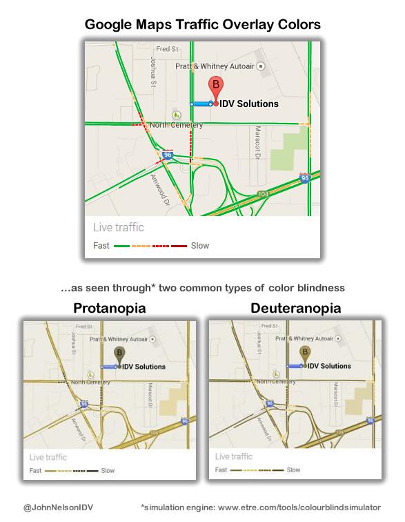
This is one of the easier problems to correct. Simply adding a slight tint of blue to the green can help colorblind users distinguish it from red, without breaking the traffic light metaphor for other users. Cartographer Andy Woodruff applied this technique to his recent map of bus speeds in Boston.
Lie #5: We can solve these problems by only showing congested traffic (i.e., the yellows and reds).
To Apple, “green” means parks, not free-flow traffic.
When Apple Maps bursted into the cartography scene, they received a lot of attention (both positive and negative). Like the other companies, Apple was also quick to offer a traffic layer. But unlike the other companies – and typical of Apple – their design followed a unique path and did not simply mimic what others were doing. In an attempt to simplify the map, Apple leaves the green category out, reasoning that users are interested in where congestion is, not where it isn’t.
Simplicity is great, and simpler maps should be the goal of any cartographer. But there is a fine line between simplicity and confusion. For all the reasons stated so far, it makes sense to focus solely on the reds and yellows. There is a major benefit to including green, though: it shows users where data exist and which street levels are considered. Leaving out green makes the map very ambiguous. Does the absence of green represent free-flow traffic, streets not included in the traffic layer, or simply a lack of available data? That’s exactly what the lack of green means in every other traffic map. Without green, the separation of the traffic layer and the base map is less defined and it is no longer clear for which roads traffic information should be expected.
So how do we solve these problems and design better traffic maps?
There are many possible solutions, and I’m hesitant to claim that an optimal traffic map exists. Different users have different needs, techniques, and map reading skills. However, some of these problems can be solved, at least in part, by better aligning map design with the tasks users wish to carry out. I’m interested in travel time, as I believe that is the most important information traffic maps can communicate. As a result, I suggest two simplifications.
Solution 1: Fix segment lengths to a standard unit of distance. When using the red-yellow-green color scheme, you forfeit accurate velocity estimation. The least you can do, then, is to make it easy for users to estimate distances. By fixing the colored segments to a fixed length (e.g., 5 miles, depending on map scale), you enable users to estimate distances very quickly and accurately. This is the equal-interval approach.
Solution 2: Show temporal, not geographic, segments. Instead of showing travel times indirectly, through velocity and color, travel times can be embedded directly into the road network. This is the fixed-minute method, because each cartographic symbol (or segment) represents some number of minutes of travel time.
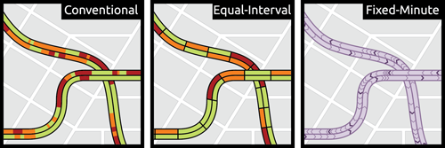
Two improvements (middle and right) to the conventional traffic map (left).
The fixed-minute approach is particularly interesting because not only does it depict travel times directly, it does so without any of the problems introduced by previous traffic map designs. Determining travel times becomes as simple as counting segments. In the example above, each purple ‘chevron’ symbol represents 1 minute of travel time. The darker, bolder symbols represent 5 minutes. With the fixed-minute design, users can estimate travel times far more accurately, and in much less time, than is allowed by the other designs. For this reason, it’s not surprising to see that users in our study liked it much more than the other traffic map designs:
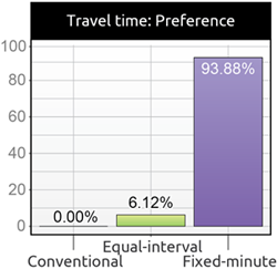
Not a single participant prefered the conventional design.
Wondering what a traffic map, using actual traffic sensors, looks like in the fixed-minute design?
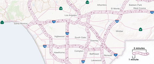
Under the traffic conditions at the time the map was created, getting from Compton to Los Angeles (via the 710 and 5) would take about 13 minutes. Such precision is not possible with the popular red-yellow-green traffic maps.
While the fixed-minute design addresses many of the existing problems with traffic maps and greatly simplifies travel time estimation, it is not without its own shortcomings. Counting segments is incredibly easy and quick to do, but it’s not an ideal task for drivers. Accordingly, finding ways to optimize both en route and pre-trip consumption of traffic data, for all users, will be a key challenge for designers of traffic maps in the future.
So let’s rethink traffic map design, recognize the failures of existing solutions, and make some changes. Given the high demand for traffic maps and the rapid growth in open source mapping tools, cartographers are better poised than ever to make their mark.