The Map of GDELT Predictions in Afghanistan as You Should Have Seen It
For the last several weeks, I’ve been creating a visualization of past and predicted conflicts in Afghanistan. The data, which come from a statistical model developed by Jay Yonamine with help from John Beieler, show us what might happen based on a long history of what has happened. The database behind this model is known as GDELT, or the Global Database of Events, Language, and Tone. GDELT has received a lot of attention lately and I’ve participated in two hackathons that have emerged around it. After Wired showed interest in publishing this story along with the visualization, I was thrilled.
What You Saw
When I heard that Wired had published the work this morning, I was excited to check it out and see how the visualization tied the story together.
And then I saw my map. Well, it was sort of my map. It had my name on it… but it was not at all how I had originally designed it. Here is the map as it is currently published:
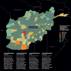
Here’s my quibble: Not only was my work altered without acknowledging the changes from the original, the change resulted in a red-green color scheme – a classic map mishap that no professional cartographer would ever make.
I’ve written about red/green colorblindness in the past. Others have too. In fact, advice on not using red/green color schemes on maps and other visualizations are practically all[1] over[2] the[3] web[4]. It’s not a new problem either: red/green color blindness has been written about by scientists for at least 120 years. We even have tools, such as ColorBrewer, to help designers avoid common pitfalls with their color choices.
By being in red and green, this map is impossible to interpret by anyone affected by red/green colorblindness (almost 10% of males, about 5% of the total population). Instead, readers with red/green colorblindness will see something like the image below (simulated protanopia):
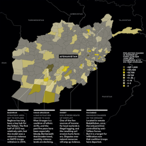
Wired's map as seen by someone with red/green colorblindness.
What You Should Have Seen
The second problem is that I intended to show readers a lot more about the data – temporal trends, the propensity of conflicts near district and country borders, and the role of Operation Enduring Freedom in the high number of material conflicts over the past decade.
This is what I wanted you to see:
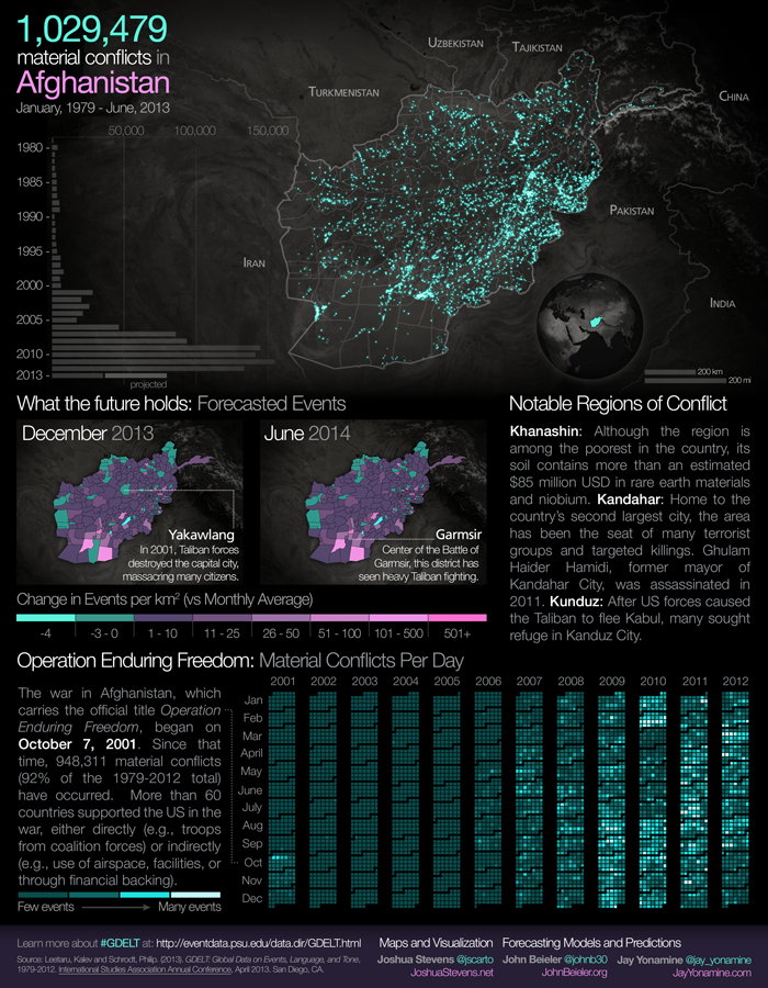
This view shows much more about the material conflicts that have occurred in Afghanistan over the past 34 years. From more than a million geocoded conflicts (check out the activity at the border between Afghanistan and Pakistan) to temporal trends, readers instantly get a better sense of the situation and how the data have changed over time. As a professional cartographer, I also made sure it is red/green colorblind-safe (preview). Naturally, I would have liked to see this version published for the article’s readers.
In the end, I really can’t change the article. But I can share the original, and I hope it provides the utility and clarity that was intended – for all readers, colorblind or not.