 Joshua Stevens
Blog
Still Bivariate, Still Curious
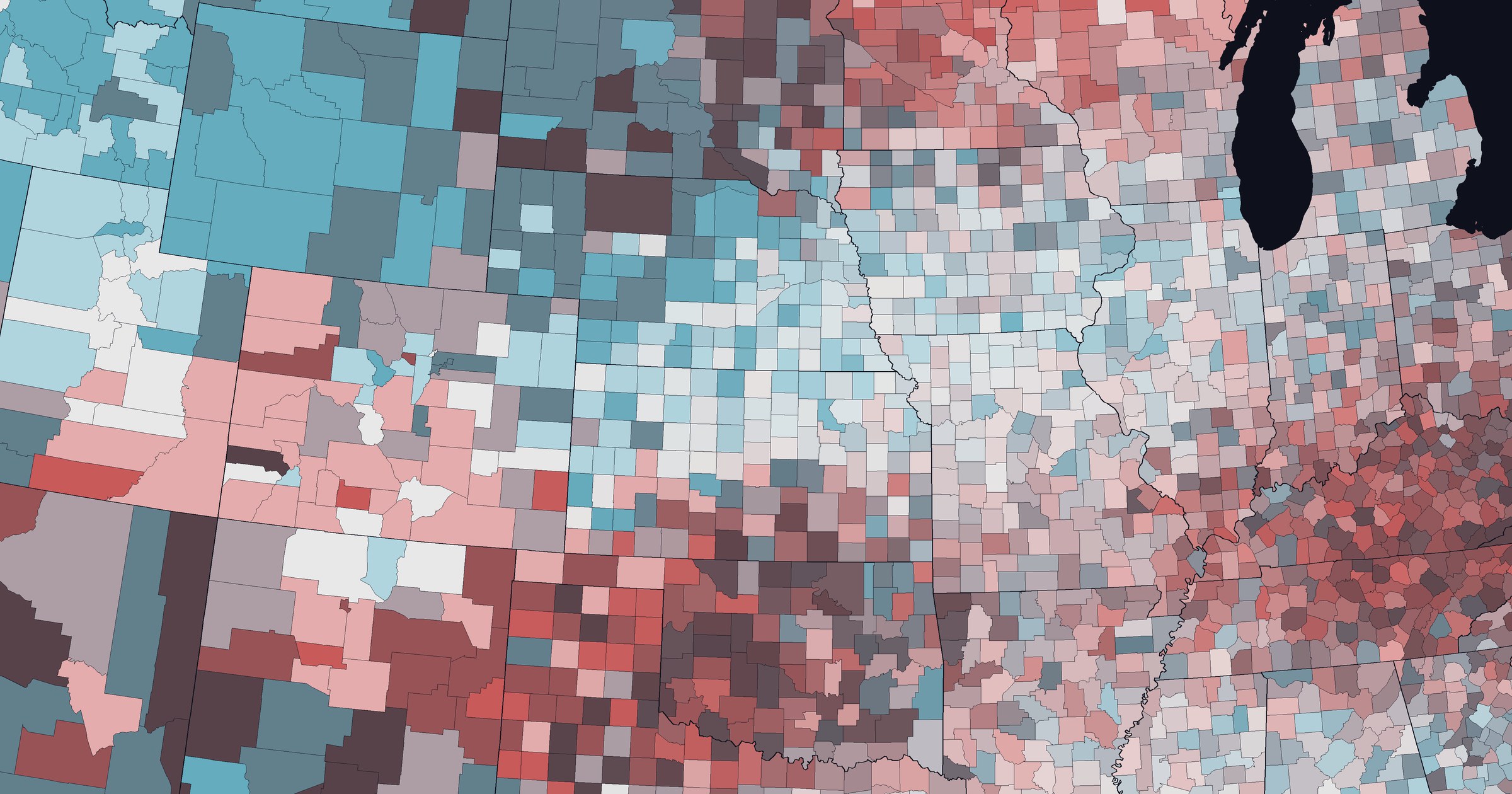
Bivariate choropleth maps, eleven years later.
October 17, 2026
Eleven years ago I wrote a how-to guide for bivariate choropleth maps, prompted by a quip I overheard at NACIS: “I’m not bivariate, but I am curious.” Back then, making bivariate maps meant blending color schemes in graphics programs, hand-tuning the corner where both variables run high, and stitching two classifications together into a single attribute your software could understand. It worked in any tool, but it took some patience.
A lot has changed since then.
Bivariate maps are now built into the tools many of us use every day, with ArcGIS Pro leading the way. Our understanding of color has caught up too, from perceptual color spaces to quick, reliable colorblind simulation. So let’s revisit the bivariate choropleth: what still holds up from 2015, what doesn’t, and how to go from an idea to a finished map in a fraction of the time.
Where We Left Off
If you missed the original post, here’s the short version. A bivariate choropleth shows two variables at once by crossing two color schemes into a grid. One variable runs left to right, the other bottom to top, and every enumeration unit gets the color for its combination of the two. Low and low sits in the bottom-left corner. High and high sits in the top right. The interesting stories usually live in the corners.
Making one in 2015 went something like this:
- Build a legend by hand. Make a 3-class sequential scheme for each variable, stretch them into squares, rotate one, and overlay them in a graphics program like Photoshop with the darken or multiply blending mode.
- Fix the colors. Nudge the saturation of the both-high corner so it stands out, and tweak the center cell until it looks like a believable mix.
- Classify each variable separately. Record the breakpoints, then calculate new fields (
A,B,Cand1,2,3) with some SQL. - Combine them. Concatenate the two fields into a single
Bi_Classattribute likeB2, because most GIS software could only symbolize one attribute at a time. - Symbolize the categories. Eyedropper each of the nine colors from your legend into the matching category. Carefully.
It worked! And it worked in any software. But it was a lot of steps, and every one of them was a chance to make a mistake.
The post traveled further than I ever expected. The four color schemes I shared took on a life of their own. They exist now in ArcGIS Pro and became four of the original palettes in biscale, Christopher Prener’s R package for bivariate mapping, and I still bump into them in maps, tutorials, and slide decks all over the place. That’s been one of the most rewarding parts of having written that post.
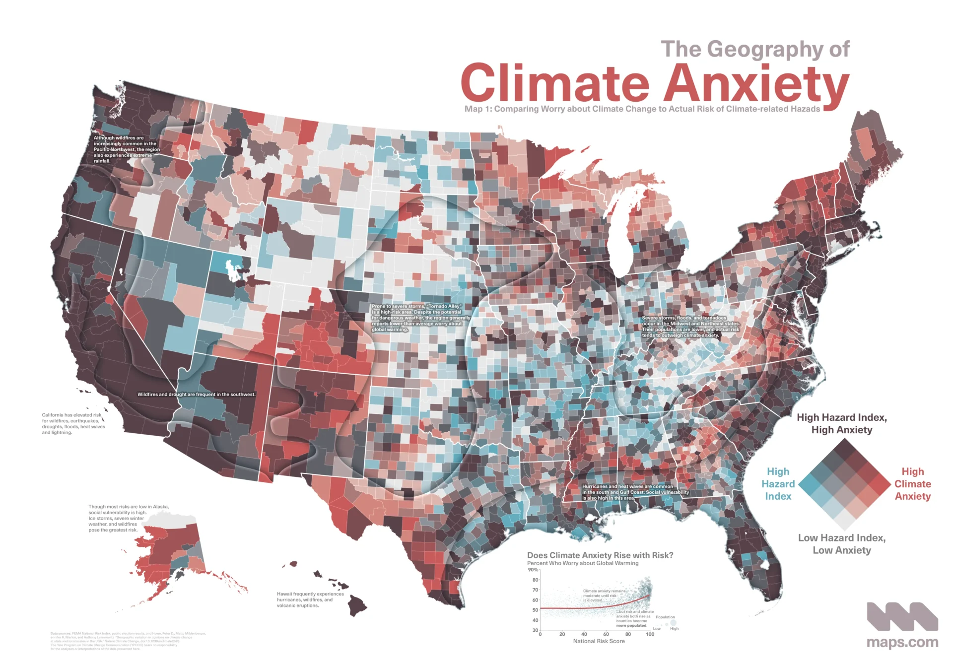
A bivariate choropleth map comparing climate anxiety and risk of climate-related natural hazards. (Source: Joshua Stevens, Maps.com)
Software Caught Up
The biggest change since 2015 isn’t a new technique. It’s that the technique is now built in.
ArcGIS Pro
ArcGIS Pro added Bivariate Colors symbology in version 2.6, released in 2020. It handles nearly every step from the list above:
- Pick two fields (or write an Arcade expression for either one).
- Choose a grid size: 2×2, 3×3, or 4×4.
- Choose a classification method for the data. Pro calculates the breaks and assigns every feature to its cell in the grid. No combined
Bi_Classfield, no SQL, no eyedropper. - Get a legend for free. Pro draws the bivariate legend for you, and you can rotate it 45° into a diamond to emphasize the highs or lows of either variable.
That’s the entire 2015 workflow, minus the Photoshop step, in a single symbology pane. It’s genuinely hard to overstate how much easier this makes things.
Even better, Pro doesn’t lock you into its built-in schemes. Any bivariate color scheme saved in a style can be used, as long as its grid matches the size you’ve chosen. Which brings us to the color part. But we’ll get there in a moment.
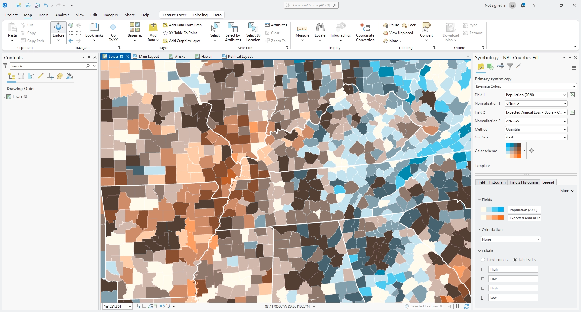
Creating a bivariate choropleth map is a breeze in ArcGIS Pro.
Esri’s web side has had a version of this for a while, too. ArcGIS Online added the Relationship mapping style in June 2018, which builds a bivariate choropleth (and its legend) from two attributes in a few clicks.
Everyone else
In R, biscale wraps classification, color scales, and legends into a handful of functions. QGIS has community plugins, such as the Bivariate QGIS Plugin, that do the classification and coloring for you. And in Python or on the web, a bivariate map is a few lines of code once you have two classified variables and a lookup table of colors.
The point isn’t any one tool. It’s that “how do I get my software to do this?” is no longer the hard part. Now we can spend that energy on the parts that matter: which two variables, how many classes, and which colors.
Color Caught Up, Too
The software isn’t the only thing that improved. The way we design color for data visualization has come a long way since we were blending layers in graphics programs.
Perceptual color spaces
In 2015, I designed those palettes by hand, nudging hue, saturation, and brightness until each step looked like an even step. That works, sort of. But HSV was never meant to match how we see. A step from yellow to orange and a step from blue to purple can have the same numeric difference and look nothing alike.
Perceptual color spaces fix that. OKLab, published by Björn Ottosson in 2020, has quickly become a favorite because it’s simple, fast, and does a great job predicting perceived lightness. Mix two colors in OKLab and the result is both subjectively and objectively a great midpoint. Step through lightness evenly in OKLab and the steps look even…because they are. That’s exactly what a bivariate scheme needs along each axis.
Colorblind simulation
In the original post I suggested picking “a neighbor to the complement” for your second hue to give the scheme “a better shot” at being colorblind-safe. That was a rule of thumb, but still required verification in other tools or software.
Today, it’s trivial. Simulation models like Machado, Oliveira, and Fernandes (2009) are physiologically based and built into browsers, design tools, and dev tools. You can see how a palette looks with protanopia or deuteranopia in seconds, and even measure whether neighboring colors stay distinguishable. ArcGIS Pro has simulation models available within two mouse clicks. So check. Don’t guess.
(And be aware that colorblindness is not a binary: People experience various degrees of it, from mild to severe. What passes when simulated to you may still fail when experienced by someone else.)
Reading bivariate maps
Cartographers have studied how people read these maps for a long time. Judy Olson, who served on my graduate committee, was working on this in the 1980s. She found that readers could follow the ordering of each variable, but that judging the relationship between them was harder than comparing two separate maps side by side. Bruce Trumbo laid out principles for coloring bivariate maps the same year, and more recently Strode et al. (2020) turned those principles into practical models for choosing a scheme based on the question your map asks: the corners, the range, or the diagonal.
Others have explored alternatives and refinements. Retchless and Brewer (2016) tested bivariate designs for showing climate data alongside its uncertainty, and value-suppressing uncertainty palettes (Correll, Moritz, and Heer, 2018) rethink the grid entirely when one of your two variables is uncertainty.
The takeaway hasn’t changed much since 2015: bivariate maps are powerful, but they ask more of your readers. Keep them simple, label the corners, and make sure a bivariate map is actually the best tool for the job. And provide interactivity, either to expose each variable individually or reveal more insights on action, when possible.
Continuous bivariate palettes
One more development worth mentioning: bivariate palettes don’t have to be classed. In the sciences especially, two-dimensional color maps that blend smoothly from corner to corner have been around for years. Teuling, Stöckli, and Seneviratne (2011) made a compelling case for them with climate data, where values are continuous and classes can hide meaningful gradients.
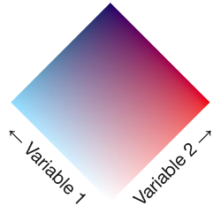
Bivariate color palettes can be continuous, too.
They’re beautiful, but they’re harder to read precisely. There are no discrete cells to match against the legend, and the middle of the square, where both variables are middling, is the hardest part to interpret. Use them when the overall pattern matters more than reading exact values.
These palettes, and maps that use them, are even more difficult to produce. Phosphor helps a lot here, making continuous bivariate color palettes as easily as their classed counterparts. But at present, using them in your software of choice requires some manual analysis and coding. Continuous bivariate visualization is not yet available in most mainstream tools out of the box.
The 2015 Advice, Revisited
So how did the original advice hold up? Mostly well, with a few updates.
Still true:
- 3×3 is the sweet spot. Nine classes is about as many as most readers can hold in their head. 2×2 is great for simple stories. 4×4 is possible, but test it carefully.
- Normalize, normalize, normalize! Choropleths of raw counts are still mostly maps of population or bias from the underlying variable.
- The corners should be the most salient colors. Corners and edge cases are usually the most interesting combination, so make them stand out.
- The two axes need clearly different hues. If both variables use similar hues, readers can only tell them apart by lightness, and the map falls apart.
- Label the corners, not every cell. Readers can infer the in-betweens.
Worth updating:
- Blending layers naively mixes colors in RGB. It works, but mixing in a perceptual space like OKLab gives you steadier lightness steps along each axis and more accurate mixes in the middle.
- “A neighbor to the complement” is no longer a guess. Simulate it.
- Complicated data classification is optional now. ArcGIS Pro and other tools can handle classification for you. The technique is still handy for software without bivariate support, or when you want to query the combinations later.
Bivariate Color Schemes in Phosphor
Many tools make creating bivariate maps much easier now. But designing them, and customizing your palette, requires great care. That’s where Phosphor comes in.
If you haven’t seen it, Phosphor is a browser-based tool I released last month for building perceptually even color ramps. It now has a Bivariate tab that brings the same thinking to bivariate color schemes. Even continuous ones.
Start from a preset or make your own. The four schemes from the 2015 post are there (Red–Blue, Teal–Pink, Blue–Green, and Gold–Purple), along with Blue–Pink and Cynthia Brewer’s Blue–Gold. Or pick your own three anchor colors: both low, high X, and high Y. Phosphor builds each axis as a ramp with evenly spaced lightness in OKLab, then combines them for every cell in between. You can even choose your own corners and Phosphor will blend the whole grid to meet it. And if you prefer a color space other than OKLab, Phosphor can handle that, too.
Shape the lightness. Choose a 2×2, 3×3, or 4×4 grid, then bend the lightness curve if you want the grid to linger in the lights or the darks.
Check it as you go. A badge tells you whether the grid holds up under simulated protanopia and deuteranopia, including the case where your two high colors look like the same hue to colorblind readers. Phosphor also reports the minimum contrast between neighboring cells, with context from WCAG’s guidance on non-text contrast. And a live preview shows the scheme on a real county map, so you can see how it behaves on actual shapes instead of a tidy grid.
Go continuous. Flip the grid to Continuous and Phosphor blends smoothly across the whole square, with the same lightness corrections and curves. The colorblind badge gets more humble here. It can confirm a failure, but it can only say a continuous palette may be colorblind-safe, because the colors blended in the middle begin to narrow the differences and introduce a great deal of uncertainty that is not readily quantified.
Make a legend. Phosphor’s Legend Lab draws bivariate legends as a square or a diamond, with axis labels or corner labels, and exports them as PNG or SVG.
Take it anywhere. Export the scheme as hex codes, for Python or R (biscale), for the Bivariate QGIS Plugin, or as an ArcGIS Pro style. Continuous palettes export as small Python, R, and JavaScript functions, plus a CSS legend. And every palette gets a share link.
From Phosphor to ArcGIS Pro
Here’s where it all comes together. Remember the five-step process from 2015? Here’s what it looks like now:
- Design your scheme in Phosphor. Pick a preset or your own colors, choose the grid size, and keep an eye on the badges.
- Download the ArcGIS Pro style (
.stylx) from the Export section. - Add it to ArcGIS Pro. In the Catalog pane, open Styles, choose Add Style, and select the file.
- Symbolize your layer with Bivariate Colors. Choose your two fields, the same grid size as your Phosphor scheme, and a classification method.
- Pick your scheme from the color scheme menu. Done.
No Photoshop. No SQL. No concatenated fields. No eyedropper. The parts that used to eat an afternoon now take a few minutes, and you can spend the rest of it on the map itself.
A few things to keep in mind:
- The grid size has to match. A 3×3 scheme only shows up when Pro is set to a 3×3 grid.
- Classification still matters. Quantiles are a popular choice for bivariate maps because they fill every row and column evenly, but they can split very similar values. Natural breaks or other methods might suit your data better. Pick each one on purpose.
- Normalization still matters, too. The software got smarter. Raw counts did not.
It’s Still Dangerous to Go Alone
Bivariate maps went from “mysterious” to built in. In 2015 the hardest part was getting your software to cooperate. Today, the hard part is the part that should be hard: deciding which two variables belong together, how many classes your readers can handle, and whether a bivariate map is the right choice at all.
For everything else, take this: Phosphor for the colors, your favorite software for the map, and the original guide if you want to see how the sausage used to be made.
And if you make something with Phosphor, I’d love to see it!
Further Reading
- Bivariate Choropleth Maps: A How-to Guide (the 2015 original)
- Introducing Phosphor
- Bivariate colors symbology in ArcGIS Pro (Esri documentation)
- What is a relationship map? (Esri)
- biscale: Tools and Palettes for Bivariate Thematic Mapping
- Trumbo, B. E. 1981. A Theory for Coloring Bivariate Statistical Maps. The American Statistician 35 (4): 220–226.
- Strode, G., et al. 2020. Operationalizing Trumbo’s Principles of Bivariate Choropleth Map Design. Cartographic Perspectives 94.
- Teuling, A. J., R. Stöckli, and S. I. Seneviratne. 2011. Bivariate Colour Maps for Visualizing Climate Data. International Journal of Climatology.
- Ottosson, B. 2020. A Perceptual Color Space for Image Processing (OKLab).
- Machado, G. M., M. M. Oliveira, and L. A. F. Fernandes. 2009. A Physiologically-based Model for Simulation of Color Vision Deficiency. IEEE Transactions on Visualization and Computer Graphics 15 (6).